
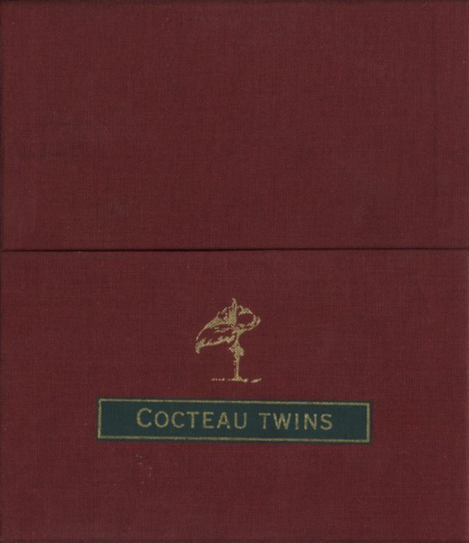
Vaughan Oliver established a label branding standard that was neck and neck with Factory’s with his stunning work with 4AD in the 1980s
I have sad news today for music lovers, but especially music-loving graphic designers. Today the first thing I noticed when catching up on the news was that famed graphic designer Vaughan Oliver had suddenly died yesterday at the far too young age of 62. Oliver had been a graphic designer who had partnered very early on with the 4AD label to fulfill much the same intrinsic art director role that Peter Saville accomplished just a few years earlier with Factory Records. Each designer was the second employee of their respective companies after convincing the founder that their services would be absolutely necessary to the businesses. And how. Neither of those labels would have ever gained their particular cultural cachet without the visuals that each designer brought to their labels.

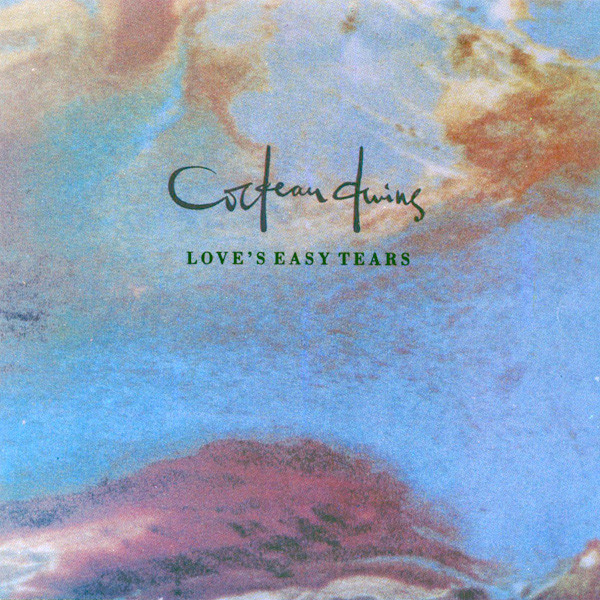
My first exposure to Vaughan Oliver took place in early 1984 when I bought this album
I first saw Oliver’s work when I saw a brief clip of Cocteau Twins’ “Pearly Dewdrops Drops” video on MTV’s “London Calling” in early 1984. Smitten, I made a bee-line to the record store [probably Murmur, but perhaps Peaches] to find it immediately! It was not there so I grabbed the only other Cocteau Twins release I saw; “Head Over Heels” on import LP. It was 1984, so I was still buying LPs, but only for another year or so. The cover was immediately striking. It looked like nothing else I had ever seen before. The credits cited 23 Envelope as the designers and I would eventually know that name to represent the synergy between designer Oliver and photographer Nigel Grierson, whose abstract textural photography was certainly front and center on the many Cocteau Twins on the label that I was practically buying by the armful in 1984. Grierson would continue a fruitful relationship with Oliver until 1987.
Many were the times I stared at a Cocteau Twins album cover trying to parse what exactly had been depicted on the cover. The first one I bought seemed to resemble a pond into which metallic silver paint had been poured over the surface. There seemed to be a fish out of frame on the right hand side of the cover. Had they really dumped paint into a pond to shoot this? Or was it an elaborate construction? I couldn’t have imagined the artists polluting a lake or pond to get this shot, but it sure looked like exactly that.
The one thing that was clear about the cover was that it was almost a perfect visual metaphor to the equally abstract and diaphanous music on the disc itself. What we didn’t know then was that the band were notoriously difficult to please and made a habit of vetoing most of Oliver’s ideas. They tended not to know what they wanted, but they certainly knew what they didn’t want. The graphic designer’s nightmare. But the synergy between the band and 23 Envelope were certainly a calling card for the band and even the label. The later Cocteau Twins releases made after they left 4AD by no means have that certain ineffable quality that their releases on 4AD had. In spades.
Label owner Ivo Watts-Russell gave the bands a certain free reign with the design of their releases. Bands were allowed to get as involved as they wanted to do, but more often than not, the in house team of 23 Envelope planted their stamp on the concepts. And after Cocteau Twins began to attract interest to the label after several years of relative obscurity, thousands of eyes were now attracted to the increasingly lush and unique house style that not only reflected the music on the discs themselves, but also the packaging thereof. After a while, people tended to buy 4AD records due to the incredible consistency of the sound and vision of the releases. They were, for better or for worse, perhaps the first example of “coffee table records.”
 At first, I had bought every Cocteau Twins release an in doing that, had amassed a large collection of 23 Envelope work but in 1985 I started buying Colourbox releases and the style on those was not dependent on the lens of Grierson and reflected a very different point of view to the Cocteau records. Here, the typography and layout was where the greatest impact was made. The fascinating thing was that a cover such as “Colourbox” [at left] was made years in advance of Photoshop; making me wonder if Oliver had been able to use an impossibly high-end Scitex/Hell system to create the cover.
 Another artist I had been collecting for some time by 1988 got an injection of Vaughan Oliver style as David Sylvian had his entire “Secrets Of The Beehive” campaign designed with the Oliver touch. The album had been a fruitful blend of Sylvian with Ryuichi Sakamoto guesting throughout the entire album to stunning effect. The subsequent Sylvian/Fripp campaign also retained Oliver for “The First Day” and its attendant singles. I managed to find the “Let Happiness In” 12″ a few years back, but the other single of “Orpheus”still evades a berth in my Record Cell. Meanwhile, I only have one of the “Jean The Birdman” CD singles and still need the “Darshan” single from that opus.

I bought this exhibition catalog of 23 Envelope work in the early 1990s
As the 80s became the 90s, I was able to acquire precious graphic arts additions to my Record Cell via the 23 Envelope Exhibition/Exposition catalog shown above. The book showed up at Murmur Records and I did not hesitate to buy it even if it was not music per se. It was an elaborately illustrated overview of nearly a decade of Vaughan Oliver sleeve design and the fact that it came with a translucent, synthetic paper dust jacket just happened to push all of my aper fetish buttons as a designer. I never saw another copy of this for sale and for half a lifetime, it was been a linchpin of my graphic design library.

I bought the 1990 4AD calendar with 12 months worth of v23 artwork
Around the same time, I saw other 4AD related ephemera for sale at Murmur. They had a collection of posters in a tube that i stopped short of. It was nearly $50 as I recall. But the 1990 4AD calendar was something that I was happy to purchase immediately! This enhanced my work cubicle that year, but was sacrificed decades later to fund some of the many music related trips of 2013 as I began amortizing my excessive possessions into travel funding. The latest work by Oliver in my Record Cell were his rich, almost impenetrable covers for Scott Walker’s late solo work on the 4AD label.
By the end of the 80s, there were four graphic designers whose work was crucial to the music that had enraptured both my ears and eyes. Peter Saville. Malcolm Garrett. Neville Brody. And Vaughan Oliver. These were the top tier designers whose work I was always grateful to see enter the Record Cell. That they formed long term relationships with many of my favorite artists was not a coincidence as they helped to craft each band’s branding each artist as much as the other members of the bands themselves. In the cases of Saville and Oliver, they transcended the branding of the bands and provided an overarching aesthetic of the label itself that issued the music. Quite an accomplishment, especially in those more naive times when “branding” was something done to livestock. Now Oliver is gone, but the work remains for we fans of music and its physical manifest. Condolences to Oliver’s friends and family who can only take cold comfort in such sentiments.


– 30 –


![Nits Enthrall For Their Golden Jubilee Concert At Royal Theatre Carré [part 3]](https://postpunkmonk.files.wordpress.com/2024/04/nits-poster.jpg?w=200&h=200&crop=1)
![Rock GPA: Orchestral Manoeuvres In The Dark [part 77]](https://postpunkmonk.files.wordpress.com/2023/12/omd-2023-black-red-andy-paul.jpg?w=200&h=200&crop=1)
![Forty Years Ago Today, Simple Minds Changed Everything with "New Gold Dream [81,82,83,84]"](https://postpunkmonk.files.wordpress.com/2022/09/new-gold-dream-in-spotlights.jpg?w=200&h=200&crop=1)


I was so shocked when I heard the news yesterday-like yourself and countless other friends,I have followed and been inspired by his work for decades.
The curved living room wall in my round house has two of his works hanging on it-framed original promo posters for This Mortal Coil and Cocteau Twins.
When I lived in Edinburgh some years ago,I went every year to see the degree shows at Edinburgh College of Art.One year I was enjoying someone’s display of work and glanced at their guestbook-the last entry on it from that very afternoon was a note from Vaughan Oliver asking them to call him and giving his number.I hope they took the plunge.
LikeLiked by 1 person
Gavin – I am used to the giants of music dying [as sad as it is] but this is the first graphic designer of my “Crucial Four” and no one saw it coming. That’s a great tale of Oliver scouting fresh talent. Imagine how it felt to see that in your guestbook!
LikeLike
who are your other three crucial four designers?
LikeLike
Sam – Welcome to the comments! Peter Saville. Malcolm Garrett. Neville Brody. But Barney Bubbles probably should be the fifth!
LikeLike
Sad news indeed. I followed 4AD right from the start.Modern English,TMC,CocteauTwins,DCD,Colourbox and so many more.Until about 1988 when the music no longer appealed. I still have all of it on LP and 12″. The music and artwork were one and the same.
LikeLiked by 1 person
Jordan – Yes, once 4AD started signing Americans it was the end of an era. Though there are a LOT of Pixies fans out there, I’m not one of them. I did come around to enjoying Throwing Muses after a while, though.
LikeLike
He was the reason I wanted to study graphic design at college. A true hero of the genre.
LikeLike
So…did you eventually study graphic design at college? Don’t keep us in suspense.
LikeLiked by 1 person
Yes I did. I spent a glorious five years in higher education studying art before fixing up printing presses and running a print works from 1997 to 2004.
LikeLike
Very sad news.
LikeLike
In the early 90’s I saw a (FREE!) exhibit by Bill Viola and some of the physical art involved intersected a lot with the Russell Mills style work that you mention here.
A huge part of the installation was a giant tree trunk with roots and branches that was lit up and it immediately made me think of a spinal column and neurons (years…decades… later when I saw Twin Peaks Season 3 I thought of this thing when I saw the “Evolution of the Arm”).
Really cool stuff, there were also video installations that he did that were very meditative and I found a collection of some of them on a Criterion laser disc!
All of this was concurrent with me going from ”toe in the water David Sylvian listener” to “BUY EVERYTHING YOU CAN BY SYLVIAN!”…they seem to share a similar contemplative vocabulary.
LikeLike
4ad’s aesthetic appealed to me on so many levels. As an import buyer for a record store in the early to mid eighties, 4ad was an intoxicating mixture of art and music. As the Dead Milkmen said in one of their songs, I was an “art fag”. When you first held a 4ad Record in your hand, you knew you were in for a treat. Superior pressings and great art work on the sleeve. I still own a ton of 4ad pressings and cherish them.
There is one 45 by (I think) Sad Captains that I still want. It is something that I yearn for, but still enjoy the desire of owning it as opposed to actually owning it. It is a weird feeling, but it appeals to the music nerd in me.
LikeLike
Mel Crighton – Wow! So you were an import buyer in the 80s for a record store? Wow. You must have tales to tell. A friend of mine in college set up a Jem account for the Musicland he worked at but corporate nixed the idea so we used it personally for about six weeks before my stupid mother (who stayed at home all day and could sign for the shipments) would no longer sign for the records. She thought we were doing something shifty! Thanks for nothing, mom!
LikeLike
Sorry. The band was My Captains and it was their only release.
LikeLike
The “Treasure” album cover has always fascinated me. I find it mesmerizing. The image is familiar, yet I can’t tell you what it is.
LikeLike
zoo – I always thought it was a dressmakers dummy covered in a web of tat.
LikeLike
Oh my gosh! Now that you mention that, I see itI There were things in the pattern that I *thought* I was seeing that weren’t what I thought (a street lamp perhaps). I don’t know if this has anything to do with it this particular album cover, but I am color blind and sometimes don’t see things that are “hidden” in a picture that others can see.
LikeLike
Striking designers doing their thing in harmony with great bands doing their thing always caught my eye, and I certainly was known for taking a chance on an album by way of just the cover art — notably that’s how I found Lene Lovich before I finally clued in that All Stiff was Good Stuff! Many delightful covers from Mr Oliver can be found in my own collection!
LikeLike
Not sure if it was Modern English or the Cocteaus that marked my first 4ad purchase.
Clearly design wise my teenage self had never seen anything quite like it, for a working class kid it brought beautiful, provocative imagery into my home and for that I am very grateful. Now it’s hard to imagine a world where this visual approach didn’t exist.
LikeLike
You write “In the cases of Saville and Oliver, they transcended the branding of the bands and provided an overarching aesthetic of the label itself that issued the music. Quite an accomplishment, especially in those more naive times when “branding” was something done to livestock. Now they’re both gone, but the work remains for we fans of music and its physical manifest. ”
Are you saying Peter Saville has died? Or gone from doing record cover artwork? or ??
LikeLike
schwenko – Gaaaahh! The collateral damage of writing this stuff as hastily as I do it! Corrected, and thanks, sir. [can’t say what was coursing through my minds to hammer those words out…]
LikeLike
A true master who will be sincerely missed. Thanks for this wonderful post.
LikeLike
Thombeau – Who are my favorite graphic designers? Oliver and Barney Bubbles are gone. Malcolm Garrett, Peter Saville, and Neville Brody still walk this earth. Those are the Big Five that immediately come to mind but I’m sure I could make it a top ten with access to my Record Cell to jog my memory. I have books on Oliver, Saville, and Brody in my Record Cell. There is a Barney Bubbles book that I’ve wanted since it came out but it’s three figures now. Too late for that. But when with Mr. Garrett have a monograph I can call my own?
LikeLiked by 1 person
As a 4AD fan from the very beginning, I loved seeing Oliver’s new work as much as hearing all that new music. The two were so intertwined! I had a couple of his books and wish I still did! In fact I have very few possessions these days so live vicariously through collectors like you.
LikeLike
Thombeau – Not really much of a collector. More like a collector wannabe since money is too tight for collecting anything.
LikeLike
I hear ya!
LikeLike
My comments re;Vaughan Oliver’s passing are belated (the holiday season being productive as ever), but here’s my take on his magnificient 4AD artwork and overall contributions to the 4AD label.
I was quite taken with the Head over Heels cover (to say nothing of the music within) the first time I checked out the CD from the library 4 years ago (I’m 31, so I wasn’t around to hear Cocteau Twins and many other bands I love when they first made their respective impacts). I had the same interpretation of the cover as you did, PPM. The starkness of the HoH cover art is forever imprinted in my retina, and I can see it in my sleep. Oliver’s artworks for It’ll End in Tears, Secrets of the Beehive, Treasure, and Mesh & Lace are also huge favorites of mine, ditto the albums themselves.
Oliver’s artwork for SotBH reinforces the argument I hold that David Sylvian and Japan were critical influences on many 4AD acts, and how DS&Japan both would have made ideal artists for the label. Many of the classic 4AD artists explored ambience and silence to artistic ends like DS&Japan, particularly Robin Guthrie’s stellar guitar textures. When I listen to Tin Drum, I wonder if Lisa Gerrard and Brendan Perry were inspired to pave a similar path of eastern percussion-influenced post-punk/art rock.
I’m also happy to see that I’m not the only one unimpressed by the Pixies. I hold the Pixies and adjacent group The Breeders responsible for ruining 4AD. I once posted such thoughts on a 4AD group, essentially saying that 4AD gave in to American cultural imperialism by signing such rockist-sounding acts instead of searching for more art-driven bands. A few members raked me over the coals for expressing such views, although a few did support my opinion. I can’t fathom how Britain took such an uninspired-sounding group like the Pixies to its collective bosom, much less how David Bowie saw any appeal in them. I could understand how a group like Sparks would go down great across the Atlantic, given their witty lyrics and Anglophile sound, but not the Pixies.
LikeLike
Zach – Obviously, no Pixies [or Breeders] discs litter my collection! The only American band on 4AD I was fine with were Throwing Muses. Even then, it took me 2-3 albums to “get” them. I figured any band whose leader called himself Black Francis was a bit too precious for me! That said, I felt that Bowie’s cover of “Cactus” on “Heathen” was a highlight of that strong album; not that I’ve ever heard the original. I’m guessing that The Pixies were America’s answer to The Smiths. Love the covers. Skip the band.
LikeLike
Pingback: Obsessive or Pragmatic: Which Kind Of Collector Are You? | Post-Punk Monk