ALBUM 20: 5×5 Live | 2012 | designer: Peacock
The packaging for the next album in their sequence of releases fell to Peacock Design, who have a plethora of compilations for every conceivable label to their credit. They also have designed the recent Kate Bush and Simply Red albums in addition to the last three Simple Minds album releases. Never underestimate the management connection with Simply Red! Quietus Management runs the show for both bands as well as Jim Kerr’s ex-wife #1 both with, and without The Pretenders in tow. People have a talk in a pub, and the next thing you know, the same design firm is working on all of your clients. If you have a good lead, it makes a lot of sense to only have to deal with one company across the range of your charges.
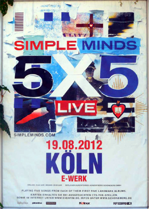
Fortunately, Peacock have done reasonably good work for Simple Minds. The “5×5 Live” was an ambitious package; two CDs and a 24 page booklet plus a poster in the now-familiar EMI Group 5″x5″ box [how appropriate] laminated with the art printed on durable paper. The poster took the basic look of the actual posters used to promote the show as shown in the image below, albeit, in a square format with no specific gig info as shown in the lower third of the image.
Their overall design theme was the familiar urban plaster wall fly posted with countless gig posters. All of their first five [six, as I call it] album images were layered and collaged with the all important modern, sans serif font used for the band name. It looks like ITC Blair Medium to these eyes. I would have chosen the same font, had it been solely up to me. But the other fonts used were more daring. In keeping with the live concert spirit of the package, all other fonts used were lo-res bitmap fonts as on a printed concert ticket. The box had a sticker on the shrink wrap [as shown on the first image] that actually did look like a ticket.
The design managed to adroitly montage the entire period iconography of the band relevant to the shows in a fairly cohesive, if flexible, fashion. It was clearly the best way to do so. The booklet featured live photos and notes by all five of the band members about the shows. Backing vocalist Sarah Brown was not on this one among all of the tours she’s been a part of since 2009. That was appropriate since the band never had a backing vocalist until 1986, which was not under the purview of this project even more backward gazing project. The cover collage then only featured a collage of Jim Kerr, Charlie Burchill, Mel Gaynor, Andy Gillespie and new addition Ged Grimes roughly assembled in Photoshop in a reflex blue and red, overprinted package. Even the CD disc art was overprinted for a minimal, late 70s effect.


![Record Shopping Road Trip: Visiting Liverpool + 81 Renshaw Records [Liverpool, England]](https://i0.wp.com/postpunkmonk.com/wp-content/uploads/2024/05/liv-81-renshaw.jpg?resize=200%2C200&ssl=1)
![Record Shopping Road Trip: Cob Records [Porthmadog, Wales]](https://i0.wp.com/postpunkmonk.com/wp-content/uploads/2024/05/cob-welsh.jpg?resize=200%2C200&ssl=1)
![Record Shopping Road Trip: 58th Mega Record & CD Fair [Brabanthallen in ’s-Hertogenbosch, Netherlands] [part 2]](https://i0.wp.com/postpunkmonk.com/wp-content/uploads/2024/05/rw-icehouse-floppy.jpg?resize=200%2C200&ssl=1)
![Forty Years Ago Today, Simple Minds Changed Everything with "New Gold Dream [81,82,83,84]"](https://i0.wp.com/postpunkmonk.com/wp-content/uploads/2022/09/new-gold-dream-in-spotlights.jpg?resize=200%2C200&ssl=1)