A wall of posters that seemed like the doorway to infinite worlds
It was over a month ago when I found myself traveling to Orlando, Florida not for a roots check, but to visit the Orlando Museum of Art on the final [HELD OVER!] day of the third, and largest, exhibit of Punk and New Wave Graphics in America as taken from the Andrew Krivine collection. I’ve written about the collection before. It was the subject of a pair of books, the first covered here, and in a case of synchronicity, I was reading the second which was given to me on my birthday last year by a good friend when all of this happened.
Bettter still, this was an occasion where I got to spend time with such backbones of the PPM community as Mr. Ware [and his family] and the almighty Echorich. The last time we’d all been together was in 2018 at the Atlanta Simple Minds concert so this was a long time coming! I had first met up with Echorich at the 2013 Simple Minds concert that we attended [with chasinvictoria] in Washington D.C. and I was afraid that I might not be able to see the gent without Simple Minds present! But of course, Simple Minds were present by proxy, as we’ll see!
We first began the day with a proper breakfast, courtesy of the Wares. Echorich drove over from the Tampa Bay area and I had arrived the day before, overnighting with The Wares. Their son, The Warewolf, has his own music blog and he arrive on the scene to dine and accompany us. I have fond memories of shopping for records with a big pack of Mr. Ware’s and our friends as the youngster gave crate diving a chance and found that he liked it.
The museum opened by noon, and we headed over to the site where there was plentiful free parking and a senior citizen like myself could obtain admission for a scant $12.00! I was incredulous when I asked Mr. Ware about buying timed tickets in advance and he scoffed it all off! I’ve not been to a museum in 25 years at least [From The Louvre to my local…and all points in between] where this was not deemed necessary! Incredible.
The show featured hundreds of examples of Punk and New Wave print design [and more] as carefully curated by the forward thinking Andrew Krivine. Who stored all of this material [for decades] realizing that it was an incredible glimpse of a foundational era in music and art. That he’s managed to turn it into two hardcover volumes [so far] which are a steal at the price they’re going for means that he’s finally getting a little return on the investment that storing all of this represented over 40+ years.
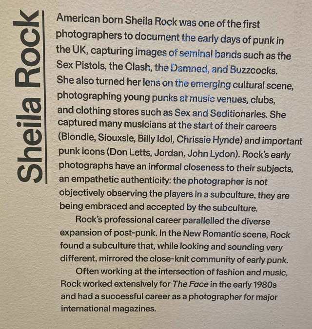
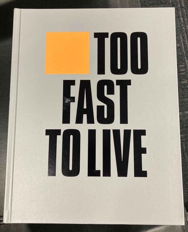
That three museum shows have been mounted on the backs of those books [with another show preceding the publication of the first one] speaks to the vitality and breadth of the collection. Since I took over a hundred photos that I am [mostly] sharing in this post, we’ll have to use slideshows that break down the show’s thrusts by necessity. Also present was a sub-gallery focused on the photography of the legendary Sheila Rock, which was another big plus. Going into this I was definitely looking to buy the “Too fast To Live – Too Young To Die” first Krivine volume which I still needed, but as we;ll see, I got more than I bargained for as we exited through the gift shop.
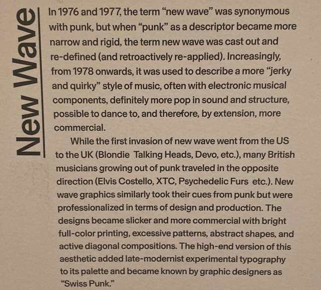
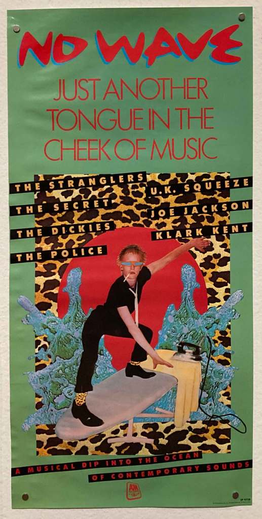
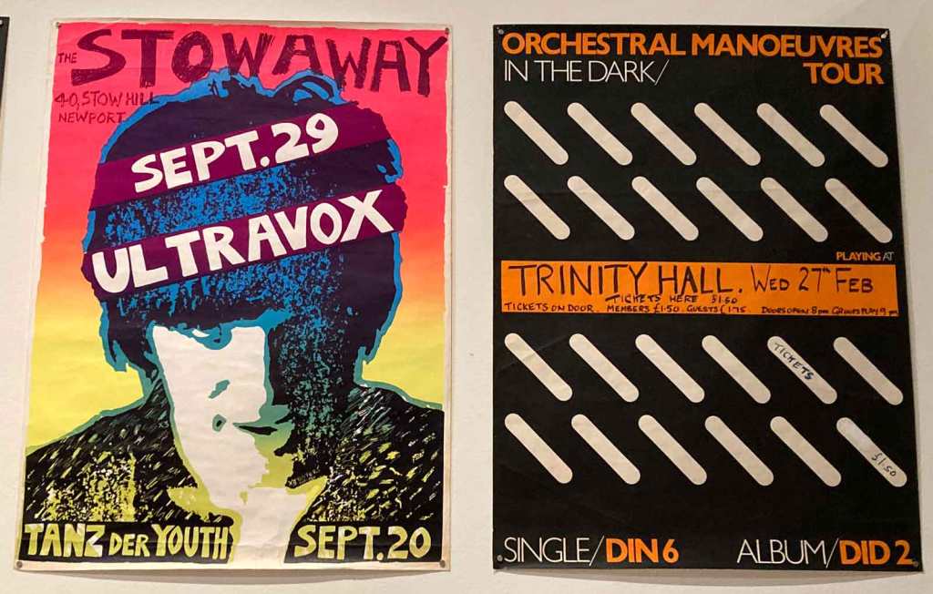
The New Wave bucket will be holding the most of the materials here.
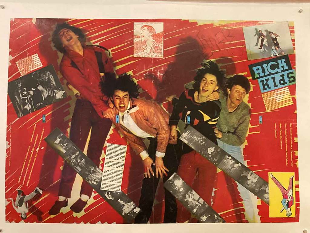
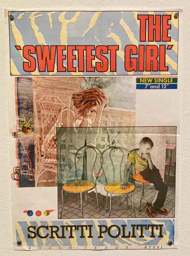
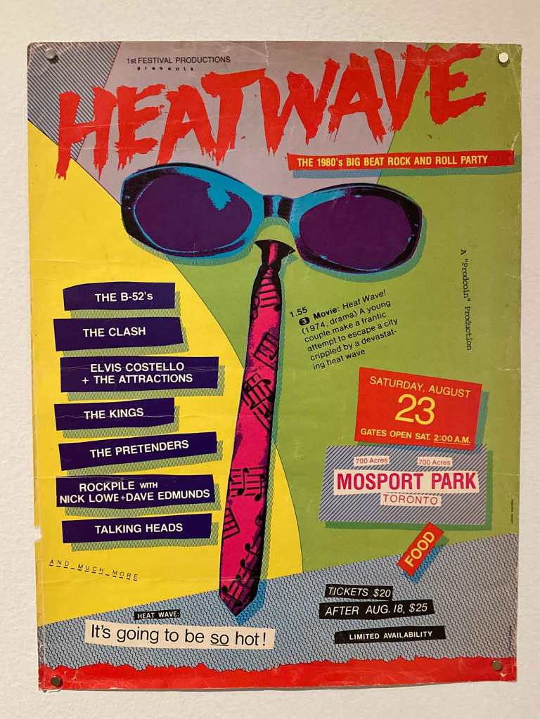
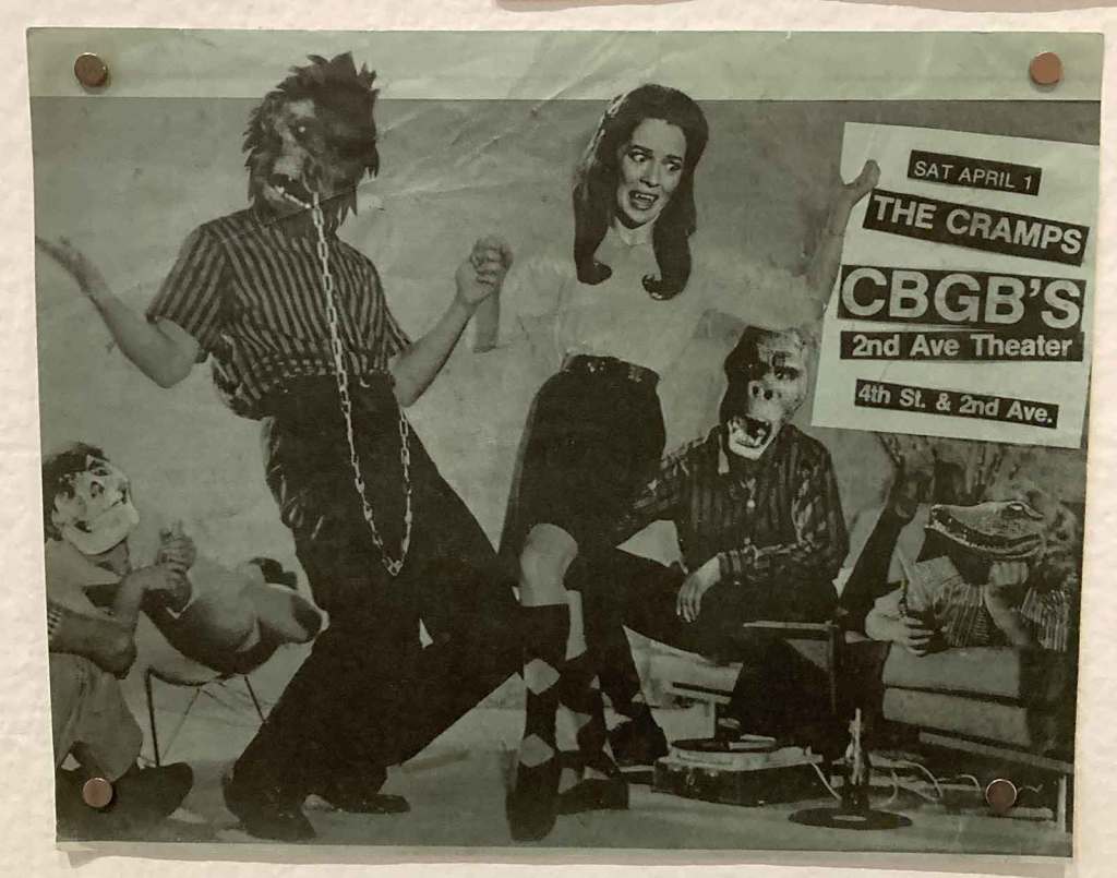
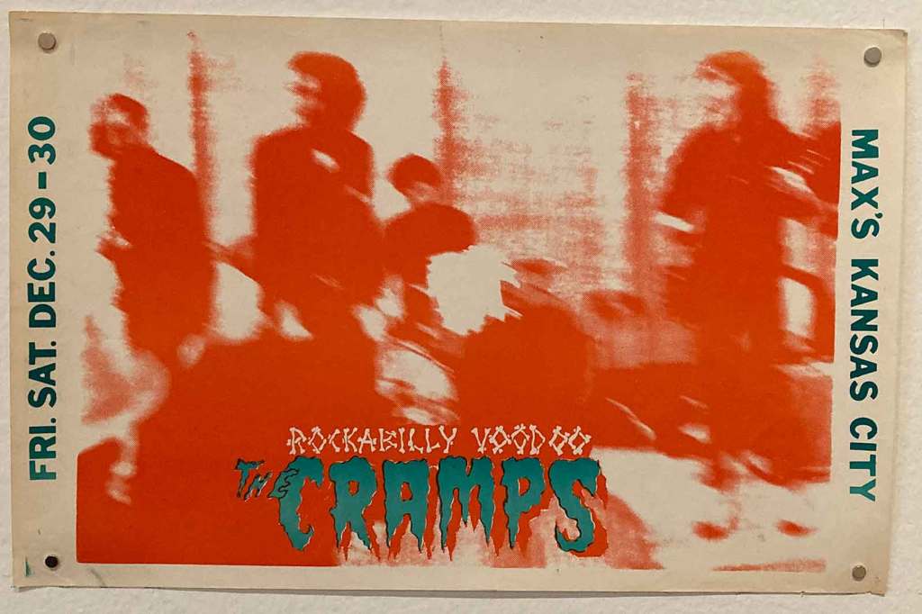
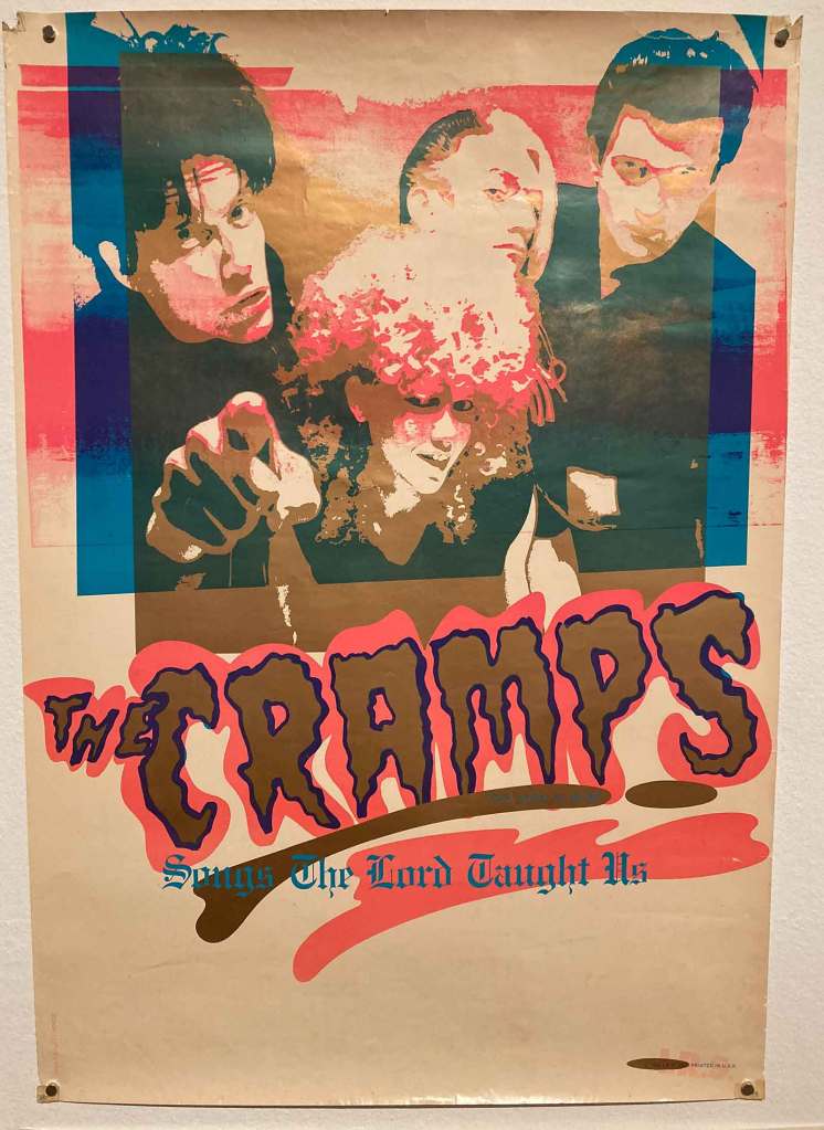
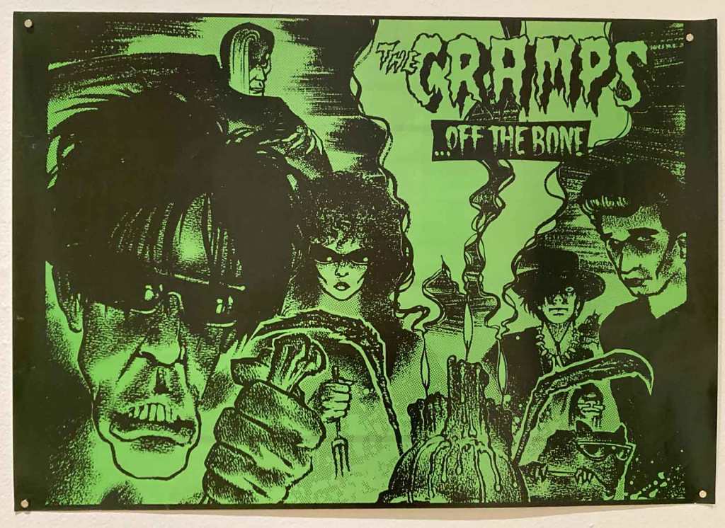
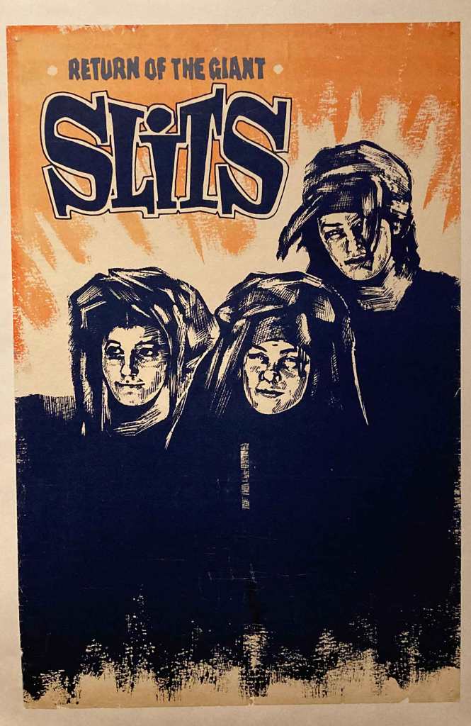
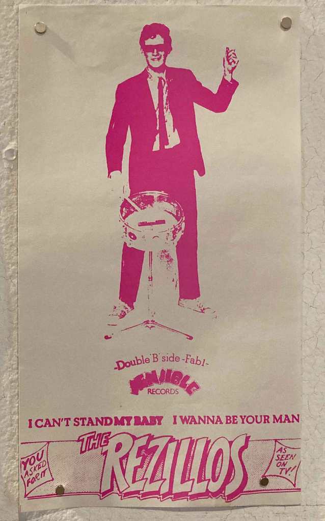
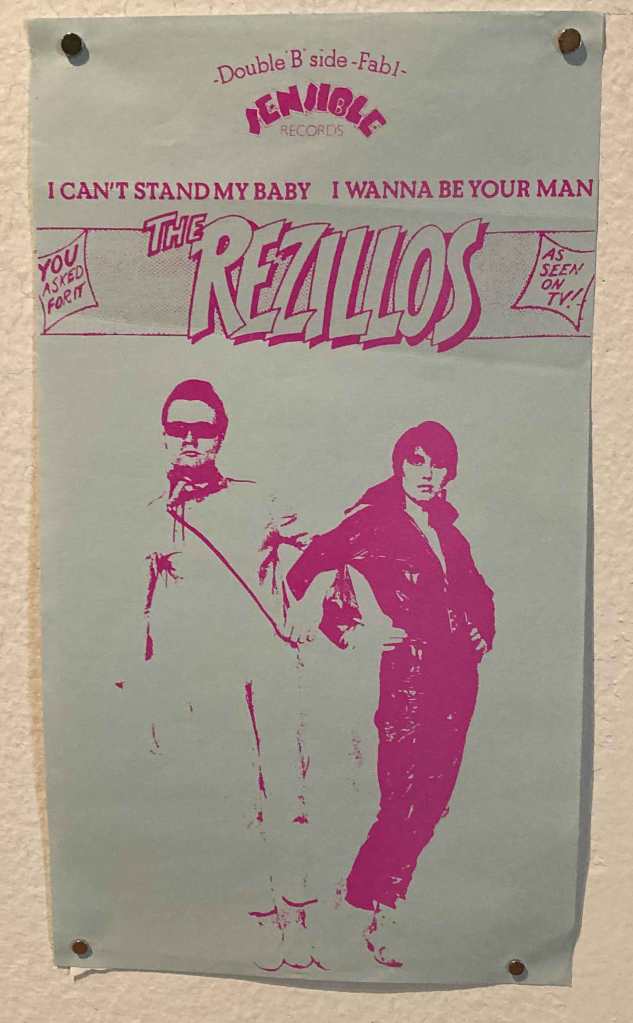
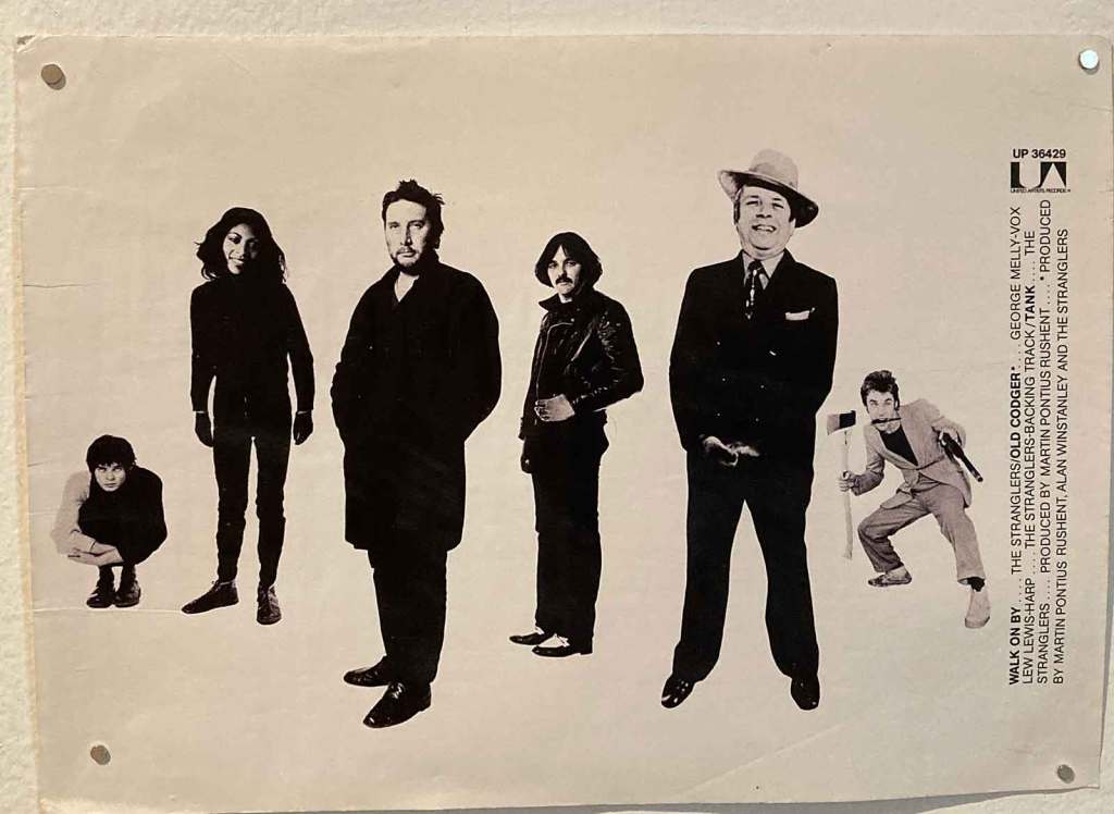
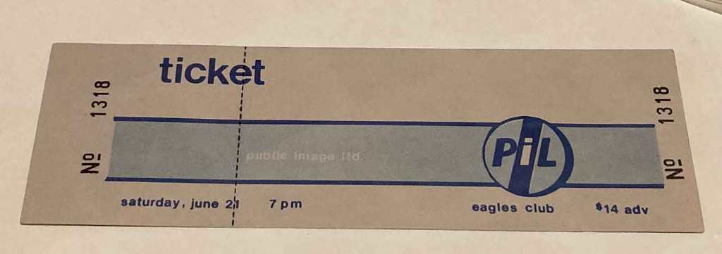
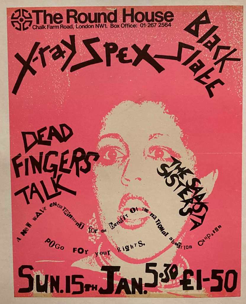
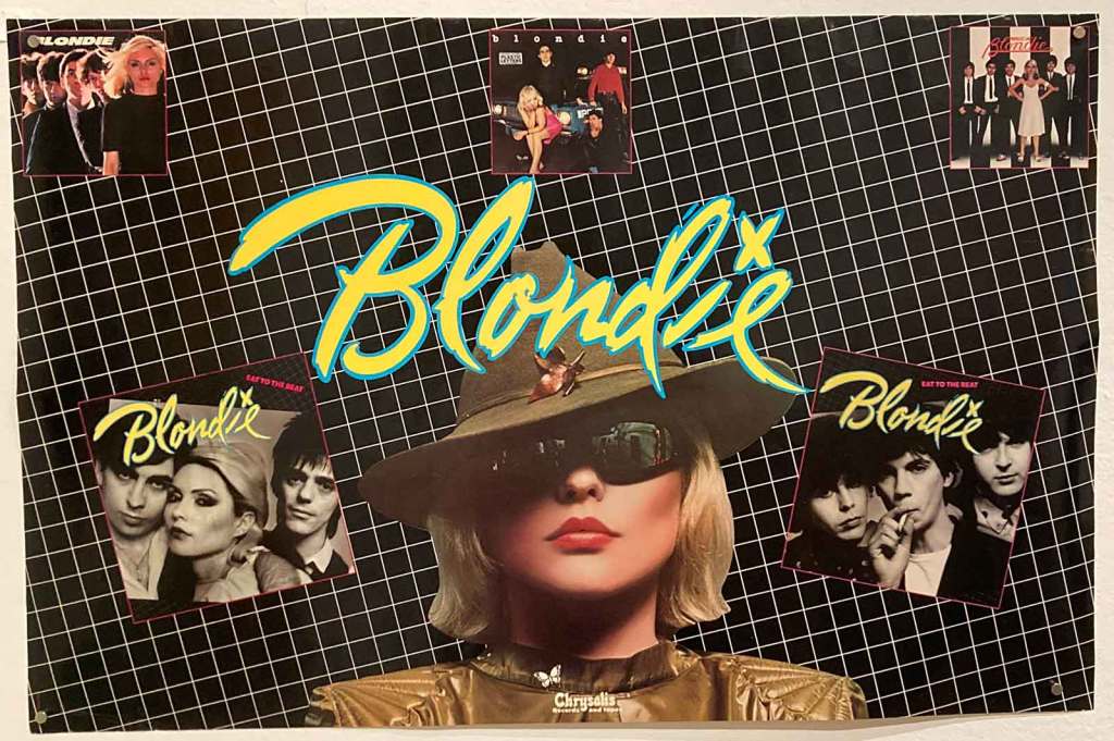
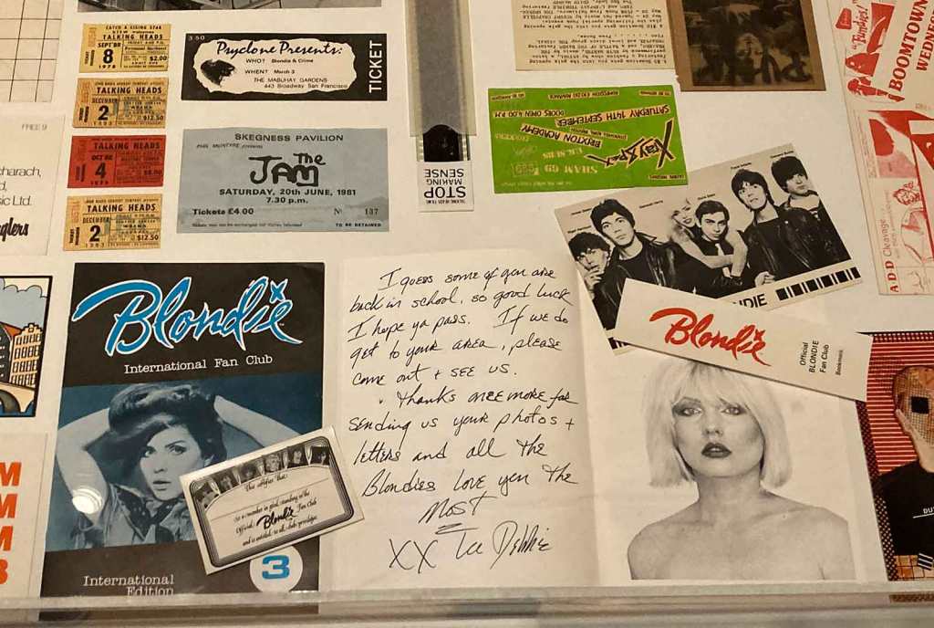
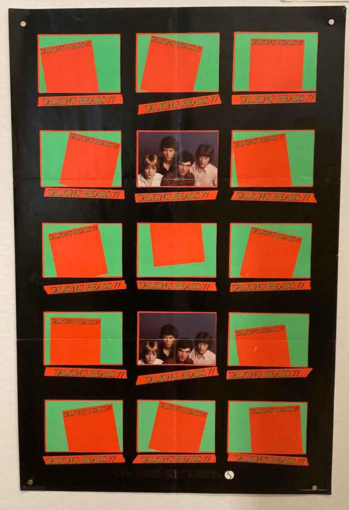
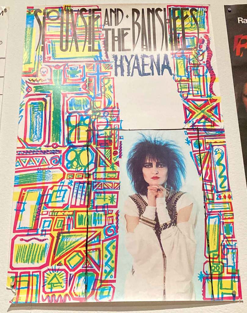
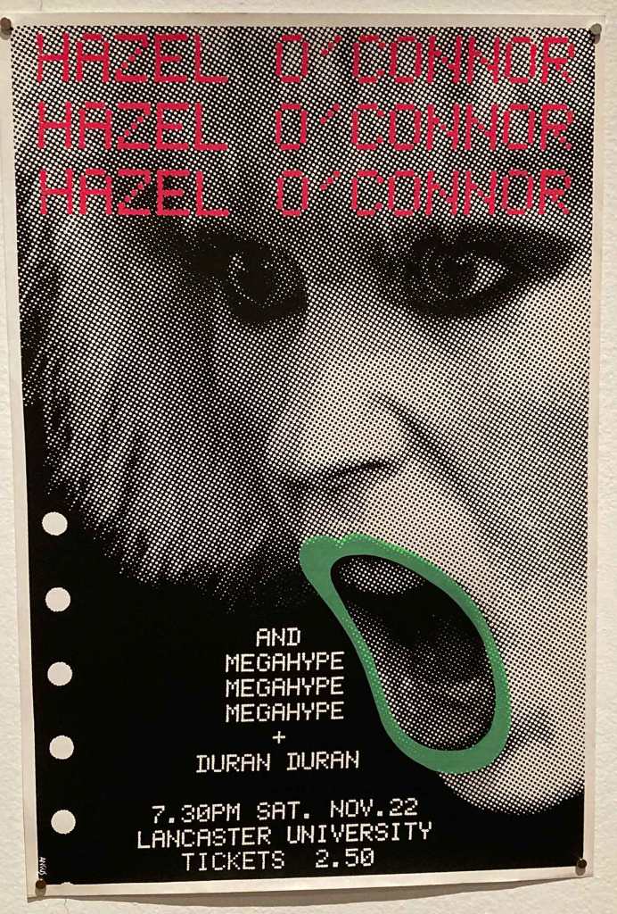
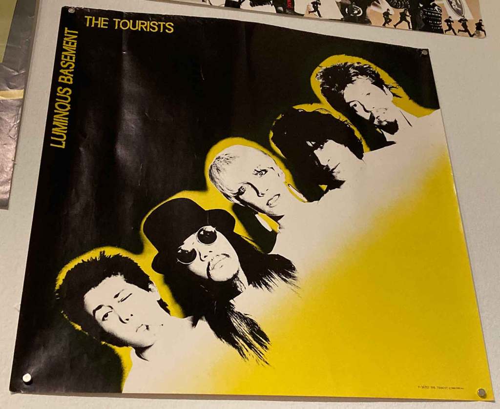
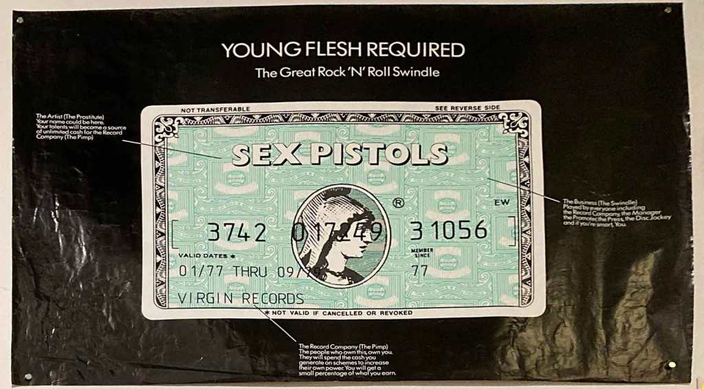
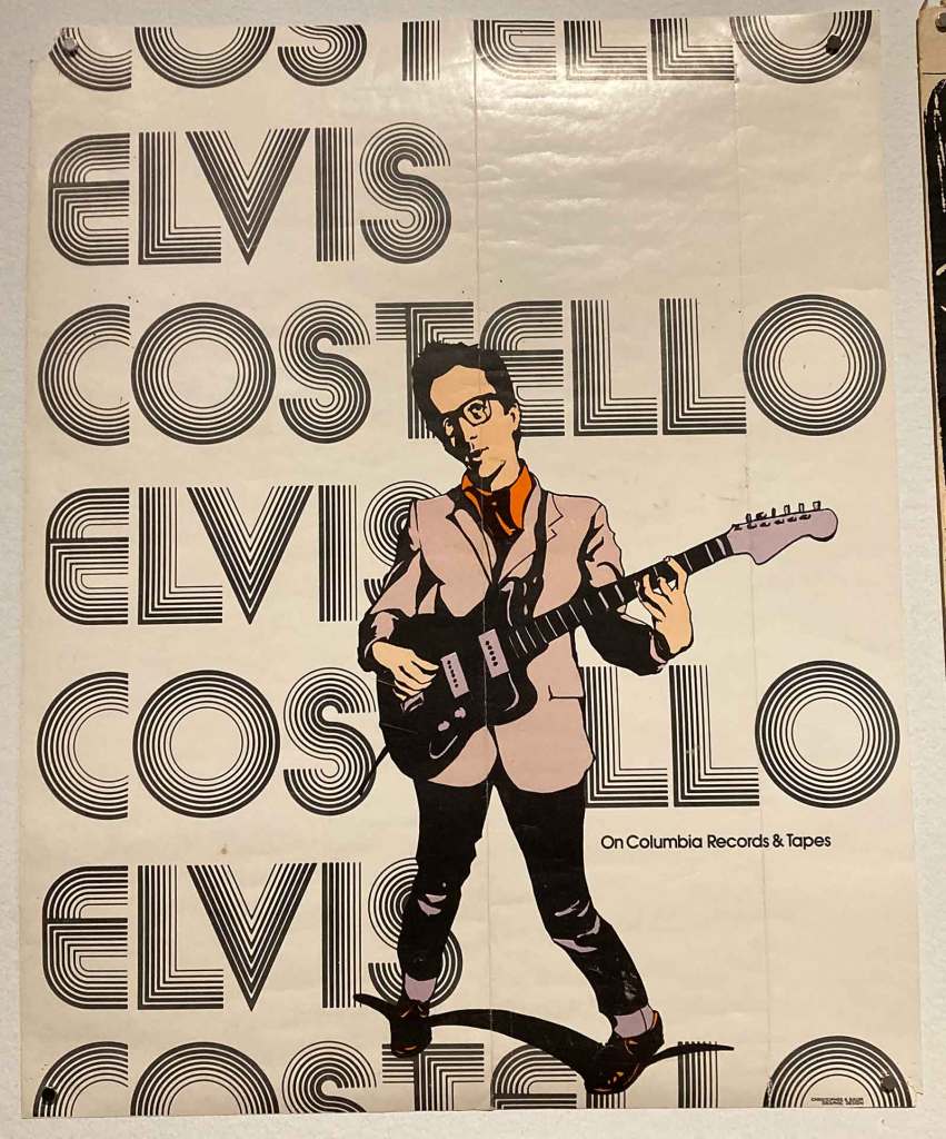
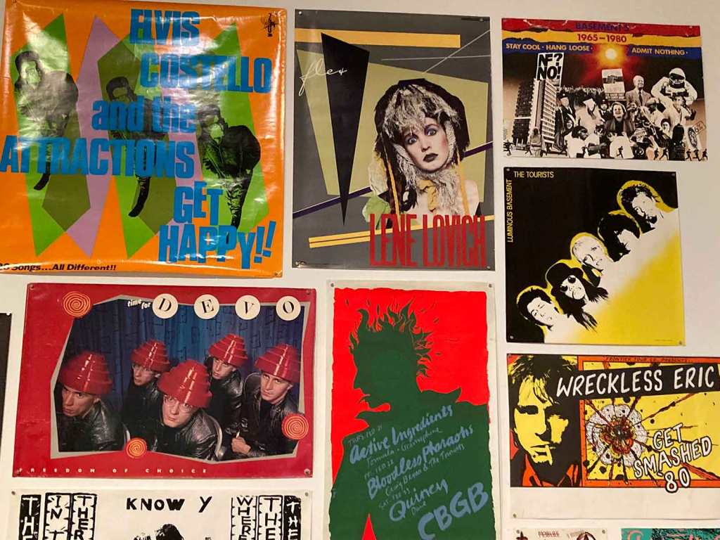
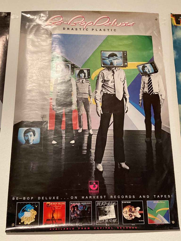
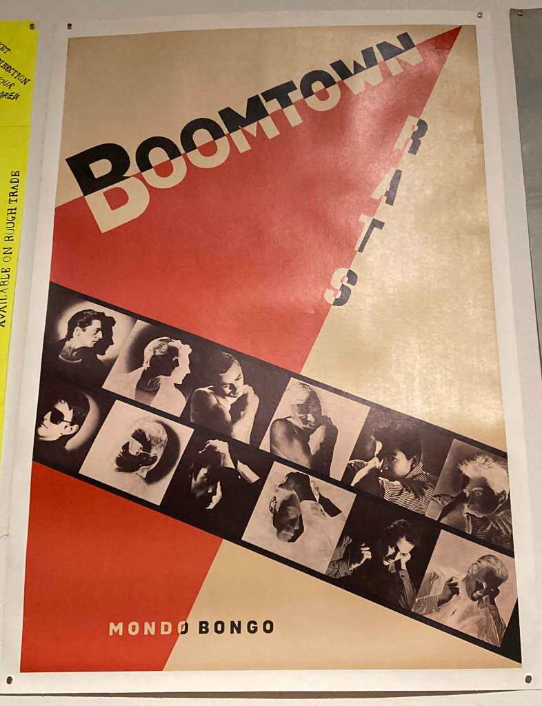
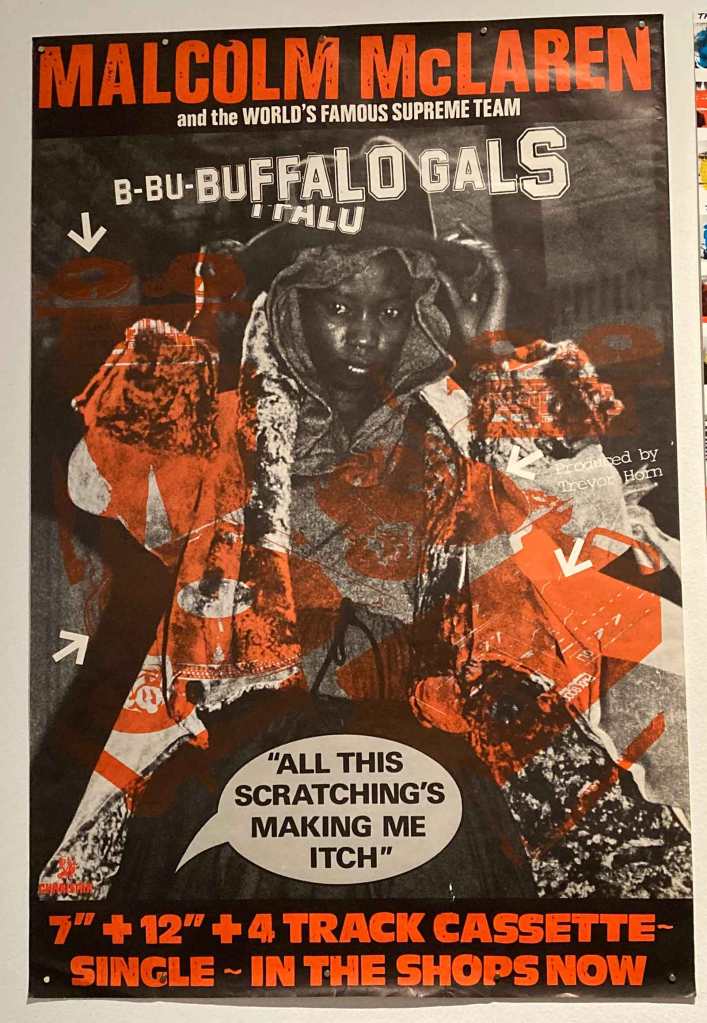
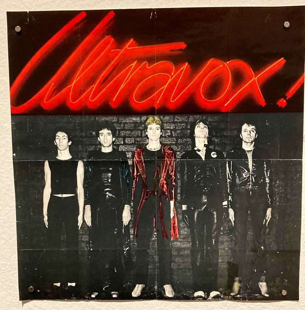
A high energy Midge Ure in this Rick Kids posterThis early Scritti Politti single poster for “The Sweetest Giirl” I remember when the Heat Wave Festival happened in 1980 in Toronto. All the rock festivals I ever heard about were Old Wave acts. Until then!This early Cramps CBGB flyer art was later repurposed into the final Cramps album coverThis poster for Max’s Kansas City showed tha The Cramps were about more than blackThis psychedelic [love the metallic inks] Cramps poster was really much more colorful than the album cover it was promoting.A classic “Off The Bone” compilation poster for the UK marketI still need that second Slits album! The scratchboard portraits are lovely.This Rezillos poster for their debut single featured Angel PatersonWhile this other Rezilos poster for their debtu single featured Eugene Reynolds and Fay FifeA wonderful poster for The Strnaglers “Black + White” album featured George Melly, who sang on the B-side of the bonus 7″ of “Walk On By” included with the LP.This missive from General Boy was featured on the DEVO fanclub newsletter in1979.A PiL “ticket”X-Ray Spex UK gig posterA classic Blondie US “Eat to The Beat” poster is what normally comes to mind when I think “New Wave.” The angled grid framework is a classic, and the logotype is my favorite of all time.Blondie fan club newslettersLene Lovich badge“Classic “Talking Heads ’77” US album poster. The poster for the album that changed chasinvictoria’s LIFE!A surprisingly light colored Siouxsie + The Banshees “Hyaena” poster.A blunt image from Hazel O’Connor and note the support act.Willy Smax’s cover design for the third album by The Tourists.A brilliant Sex Pistols poster I’d never seen before.Elvis Costello’s image used anti-appeal back then. Barney Bubbles’ clever “Get Happy” design used fake ringwear to simulate an old record.Be-Bop Deluxe predated New Wave but actually anticipated it. This final album was New Wave through and through.I’d never seen this Boomtown Rats Constructivist poster for their eclectic album “Mondo Bongo;” my favorite of theirs!As usual, Malcolm McLaren was pivoting to Hip Hip as New Wave peaked in 1983 with his “Buffalo gals” single.The first album by Ultravox! was recorded in 1976 and prefigured New Wave very strongly.
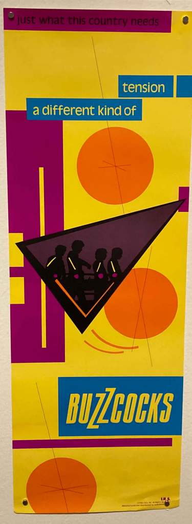
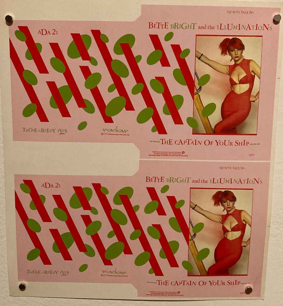
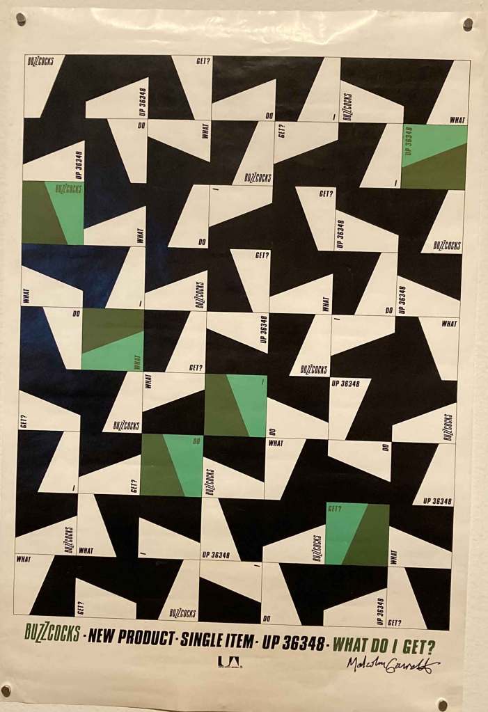
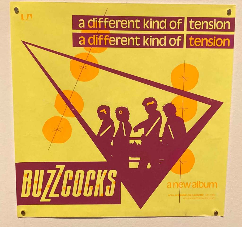
Malcolm Garrett was deemed so crucial to the show that he was one of three designers singled out by name in the curation. I can never forget seeing the first Garrett cover art I’d ever seen with the brilliant and colorful Buzzcocks “Different Kind Of Tension” artwork.
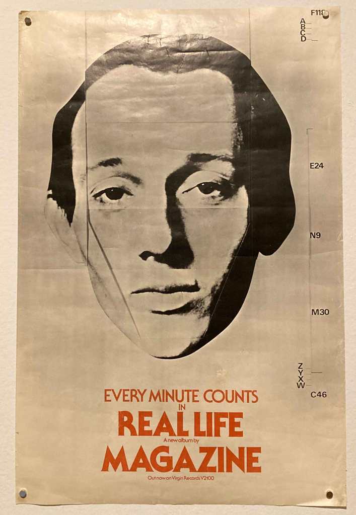
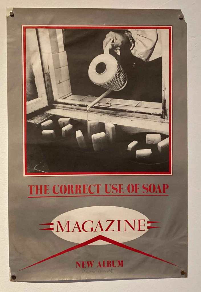
US Buzzcocks “Different Kind Of Tension” poster.The debut Magazine album was the only one NOT designed by Malcolm Garrett, but this poster in iin theis bucket anyway! I’d never seen this striking poster for Magazine’s brilliant “The ‘Correct’ Use of Soap” before this show!This uncut Bette Bright 7″ sleeve showed the Bauhaus influence in Garrett’s design.This sort of looks like Dazzle camoflage!The UK poster for “Different Kind Of Tension” used a three color palette.
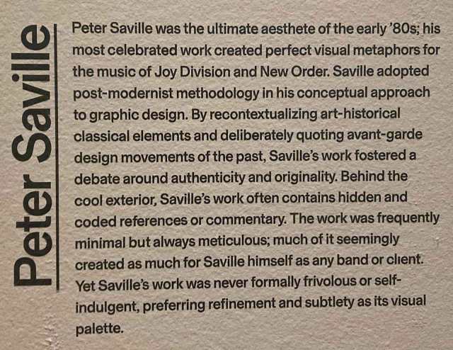
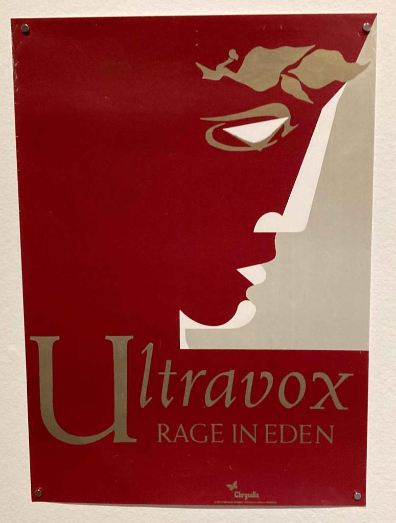
Peter Saville was another designer given their own placement in the show. He was a classmate at Manchester Polytech of Malcolm Garrett and together they were the enfants terrible of the New Wave and Post-Punk era. Saville embraced Classicism while Garrett preferred Modernism.
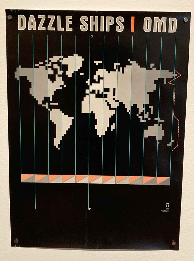
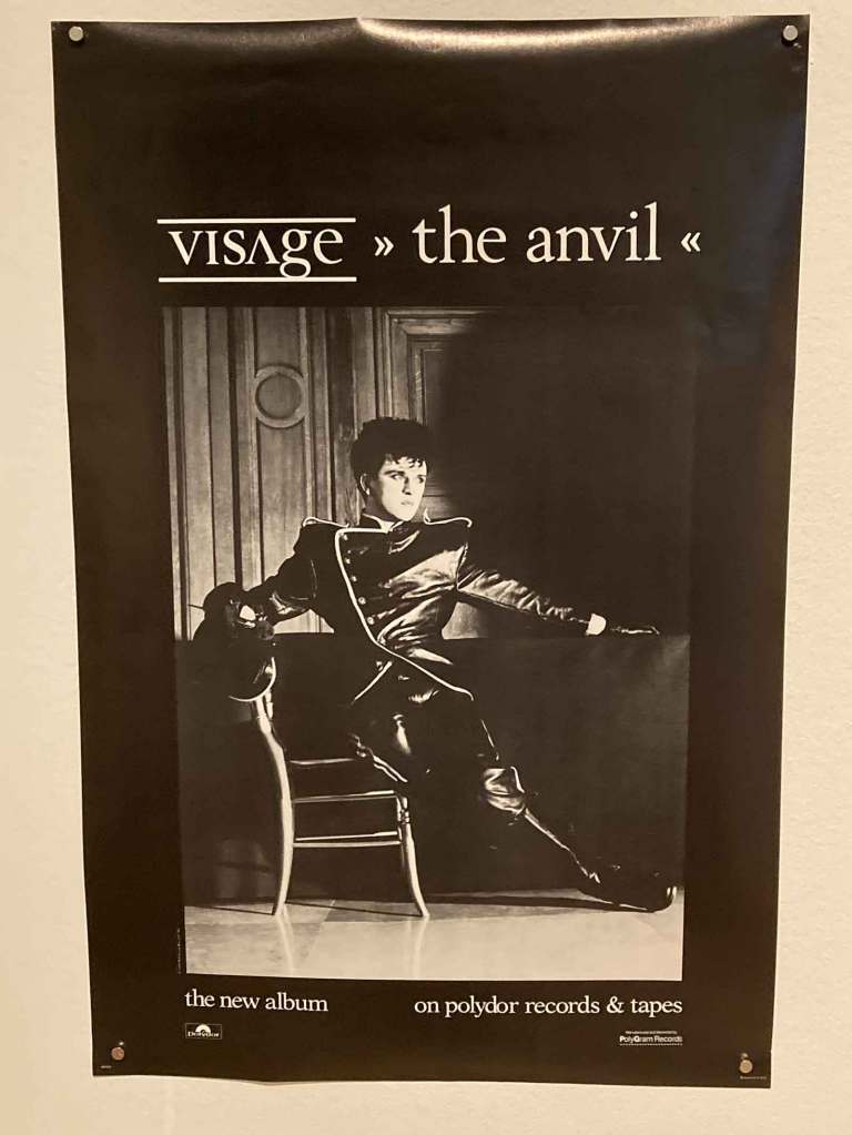
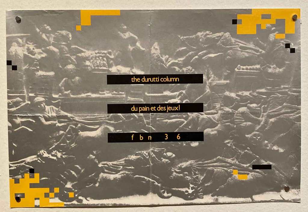
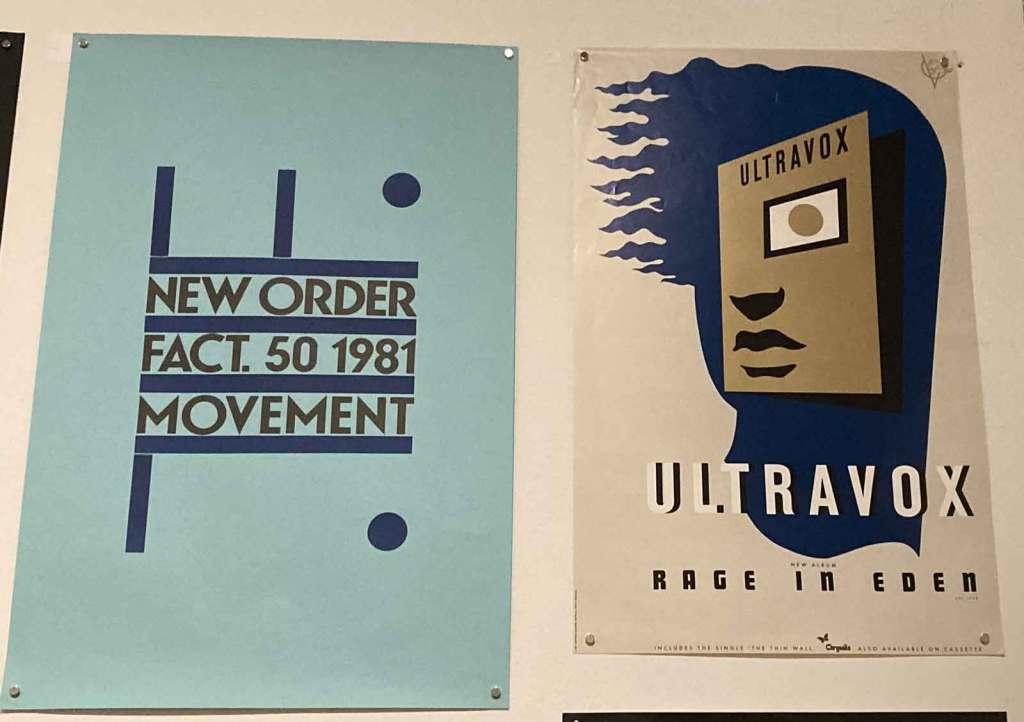
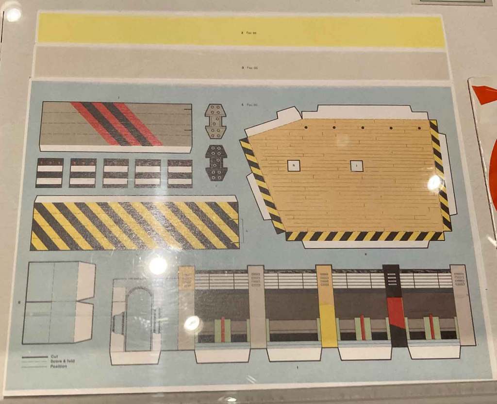
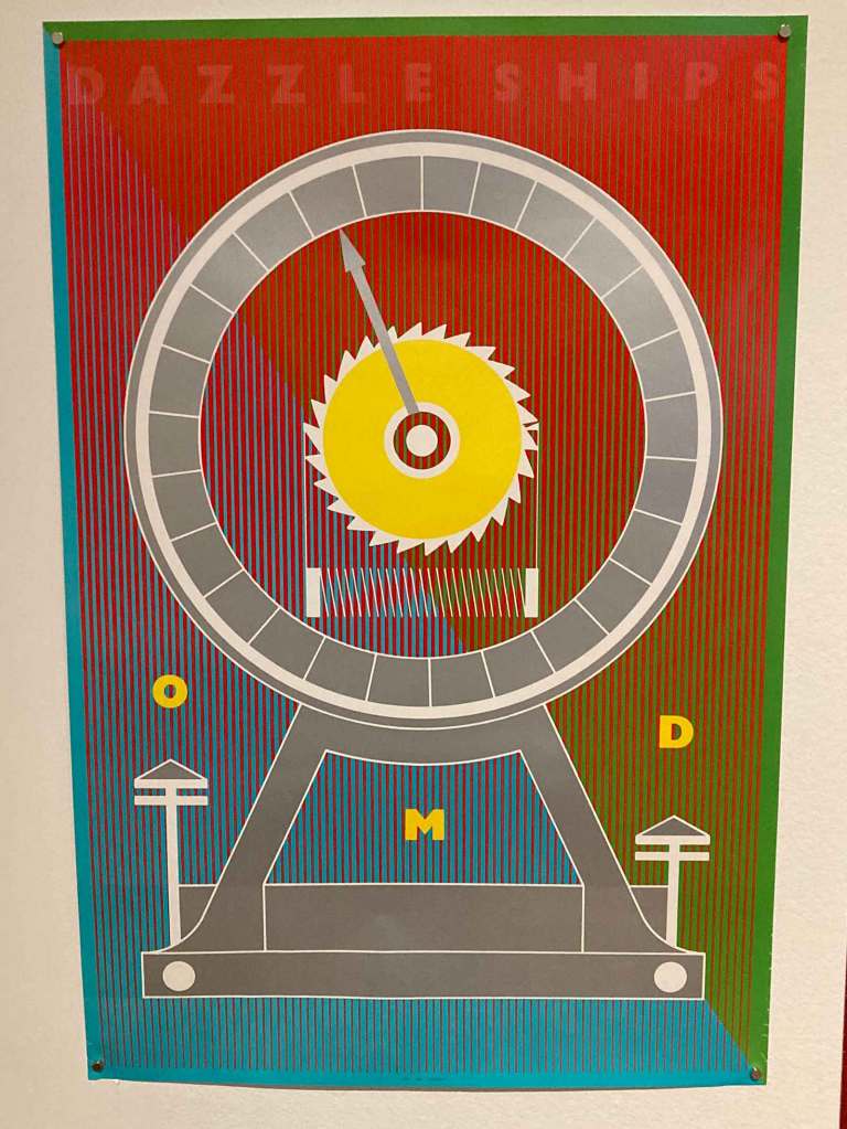
This OMD Canadian “Dazzle Ships” poster was actually a Malcolm Garrett collaboration with Peter Saville.Saville’s 1981 “Rage In Eden” campaign for Ultravox.Saville got to collaborate with photographer Helmut Newton for the second Visage album.As Factory Records’ in-house desinger, he greated a house style that gave acts like The Durutti Column a distinct face in the market.This wall of Factory Records posters features many classics from my Record Cell.Two of Saville’s disparate 1981 works in New Order’s “Movement” and Ultravox’s “Rage In Eden.”This was fac86: The 1983 Facroty Records christmas card that turned into a model of the club The Haçienda!
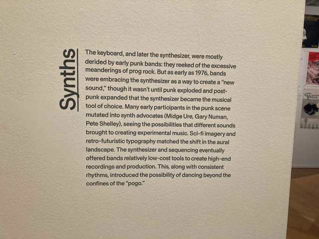
The significance of synthesizers was called out as an important thread of the New Wave movement within the show.
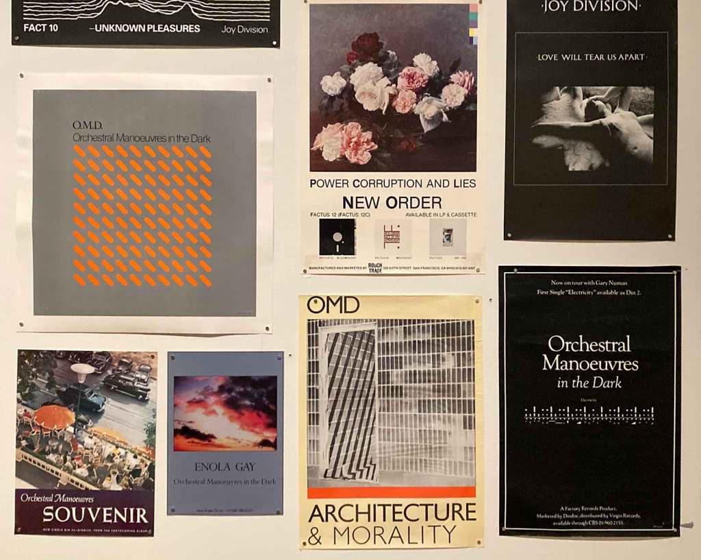
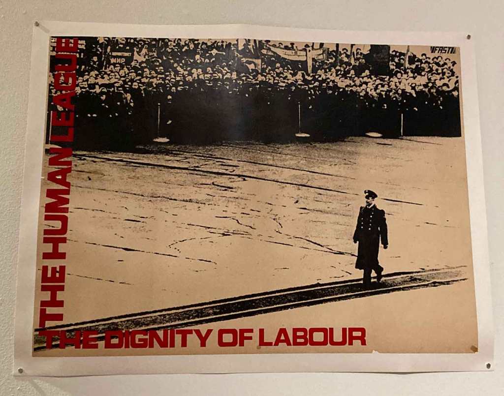
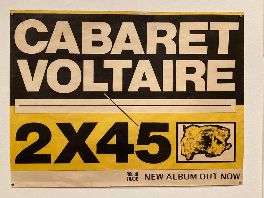
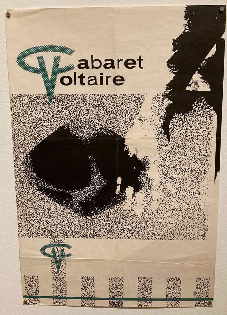
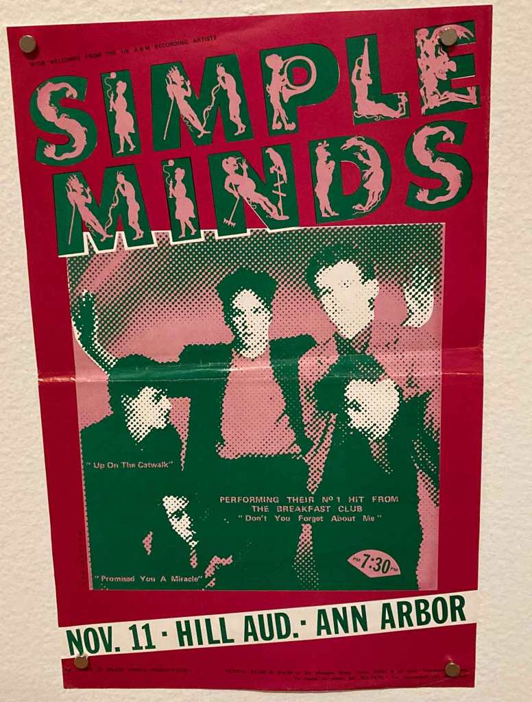
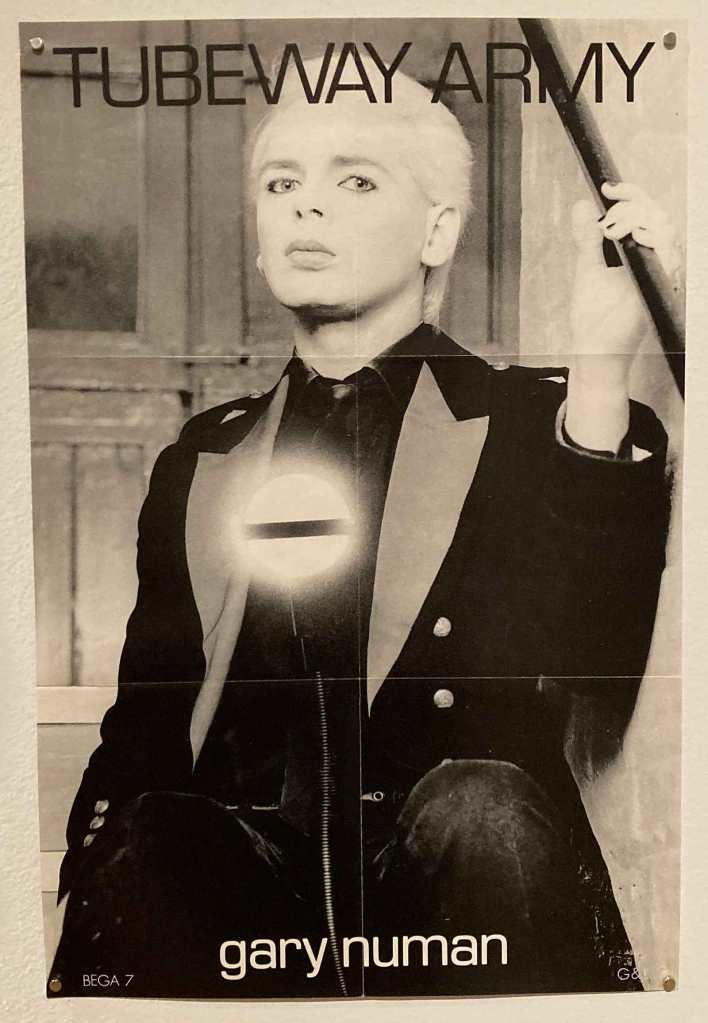
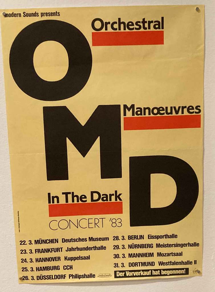
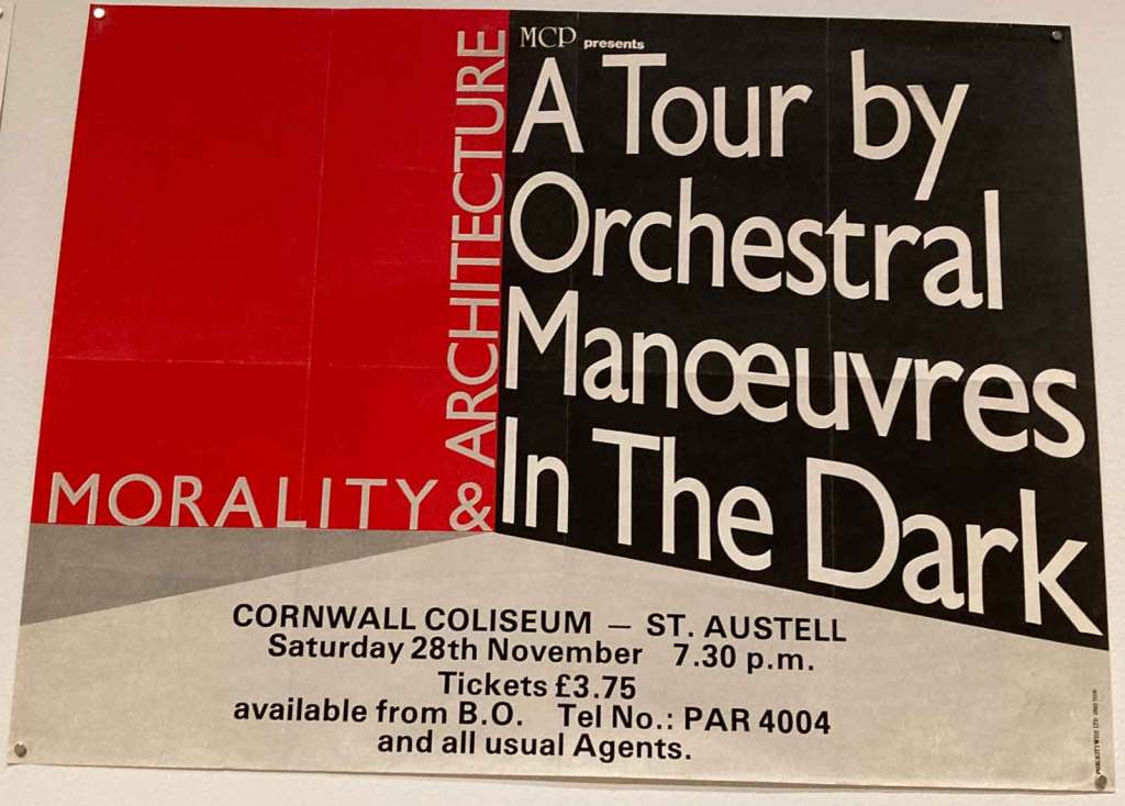
The dystopian image of the first Human League Record; Yuri Gagarin getting a hero’s welcome.Nevilel Brody should have been another individual designer this show singled out. He was the Rough Tarde in-house designer and his early work for Cabaret Voltaire was crucial.This was definitely an early Neville Brody classic for Cab Volt!This poster showed three very forward thinking bands grouping together.This is a poster from the era where Simple Minds were no longer aligned with New Wave.Gary Numan was the first modern synth star and this was a poster for his crucial “Replicas” album.I once owned this beautiful US poster for OMD’s “Dazzle Ships.” A brilliant adaptation of a Peter Saville design.This German tour poster for OMD underscored the size of their second biggest market in the 80s.Was that a John Foxx image on the Ultravox poster? The OMD poster riffed on the classic Ben Kelly/Peter Saville design of the debut album.Another OMD poster broke free of the “Architecture + Morality” style to do something very different.This OMD badge was another riff on the classic Kelly/Saville cover design.A Yello badge from their “Solid Pleasure” album period of 1980.
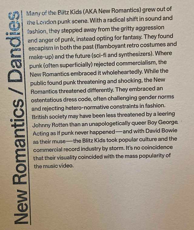
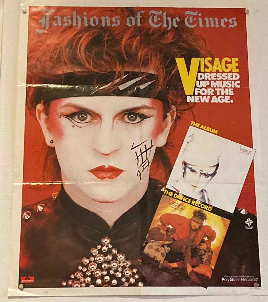
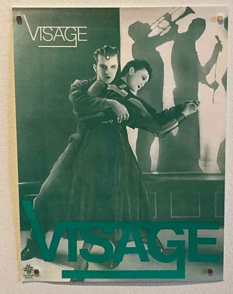
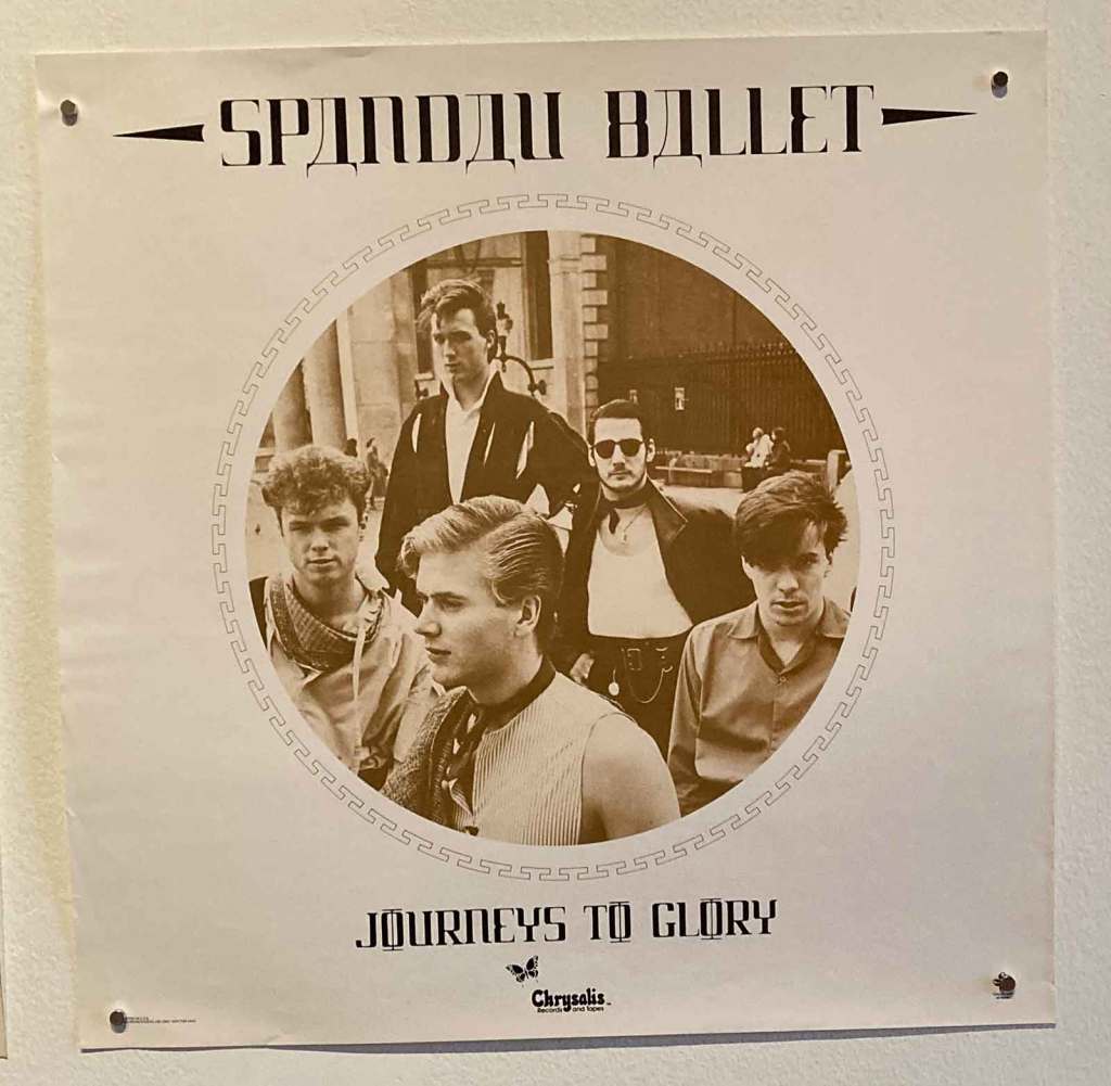
The visual vitality of the New Romantic movement meant that this show paid a lot of attention to The Cult With No Name. The Visage and Ultravox images from the Saville section, could also be here.
A US Polydor poster selling the Visage debut album plus their dance mix EP.The classic cover art to the Visage debut album was recolored from blue to green on this US poster; strangely enough.Their US Chrysalis label resorted to images of Spandau Ballet which were never on the record sleeves of this big 1981 New Romantic splash.
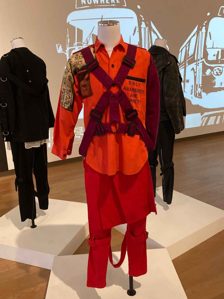
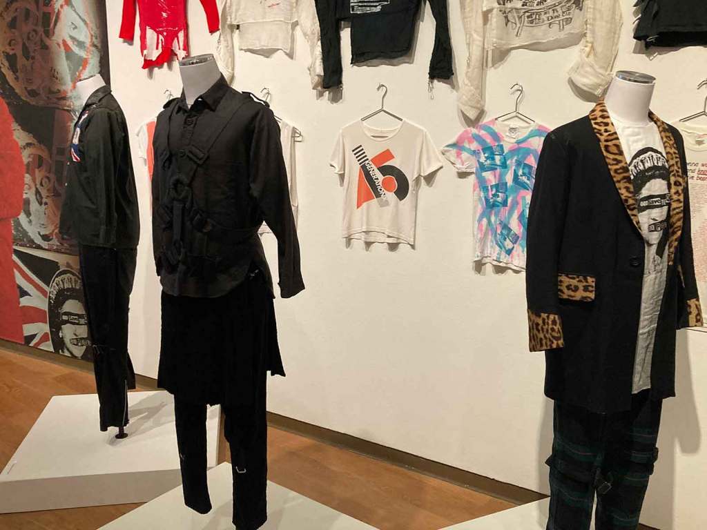
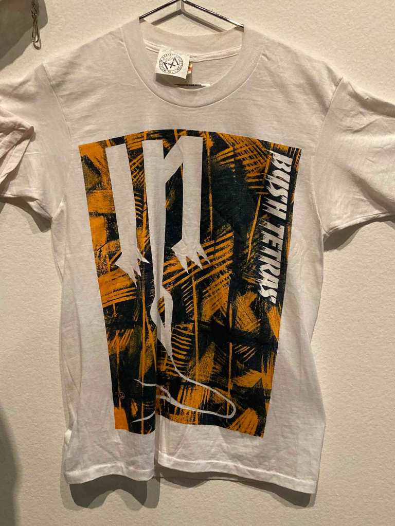
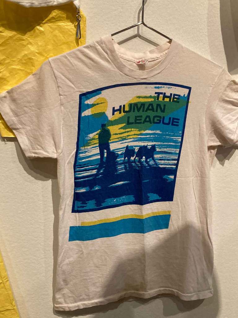
The show also incorporated elements of fashion which were intrinsic to the era.
The inexpensive but striking DEVO hazmat suits were bought inexpensively from an industrial supplier, but the Aztec Energy Domes were custom made.Bondage trousers were nothing I ever saw real people wearing…until I visited Orlando for this show! I needed to buy a disposable razor and the drugstore was staffed by a young Frenchman wearing them!The GenX T-shirt on the wall was based on a BArney Bubbles design.The Bush tetras were an electric NYC Post-Punk band. This T-shirt promoting the Human League’s “Travelogue” album uses a very different color palette to the actual record. The show even had a silkscreen frame designed for making multi-colored t-shirts!
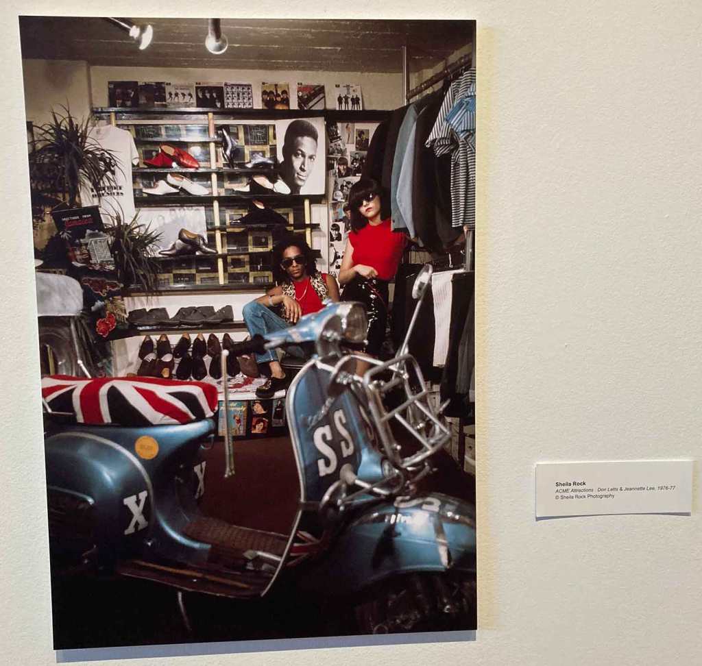
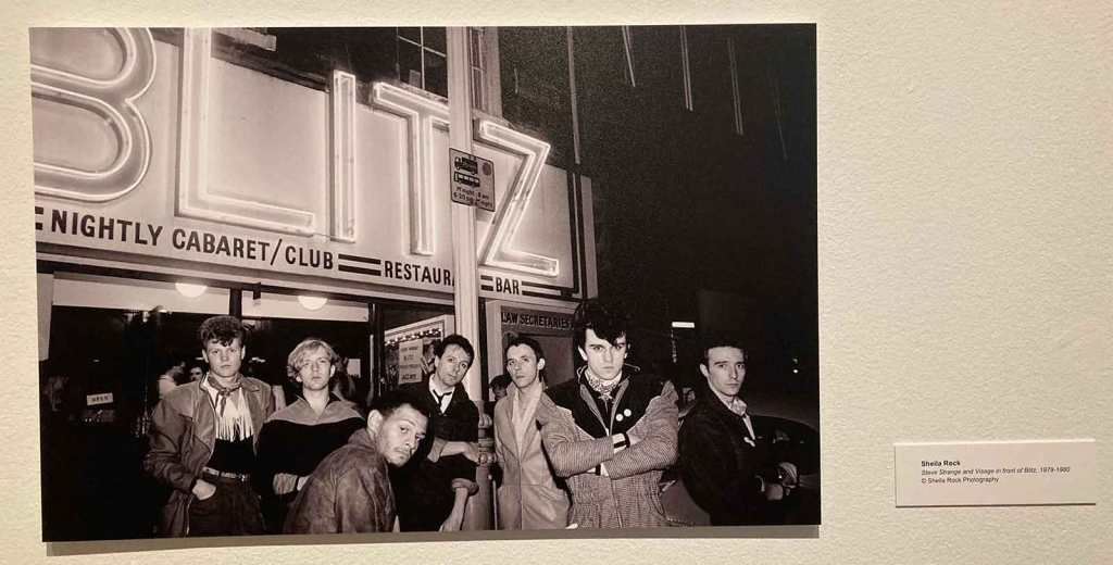
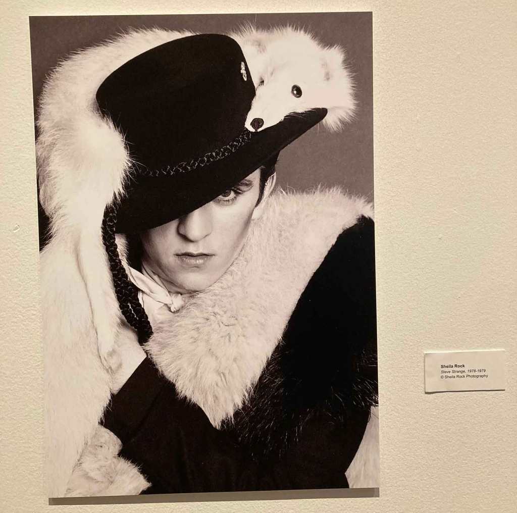
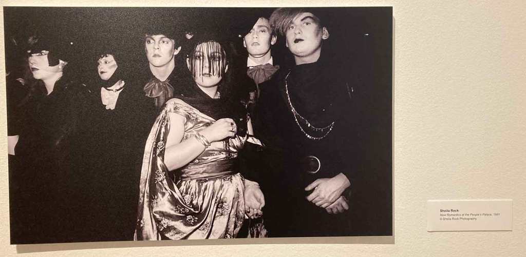
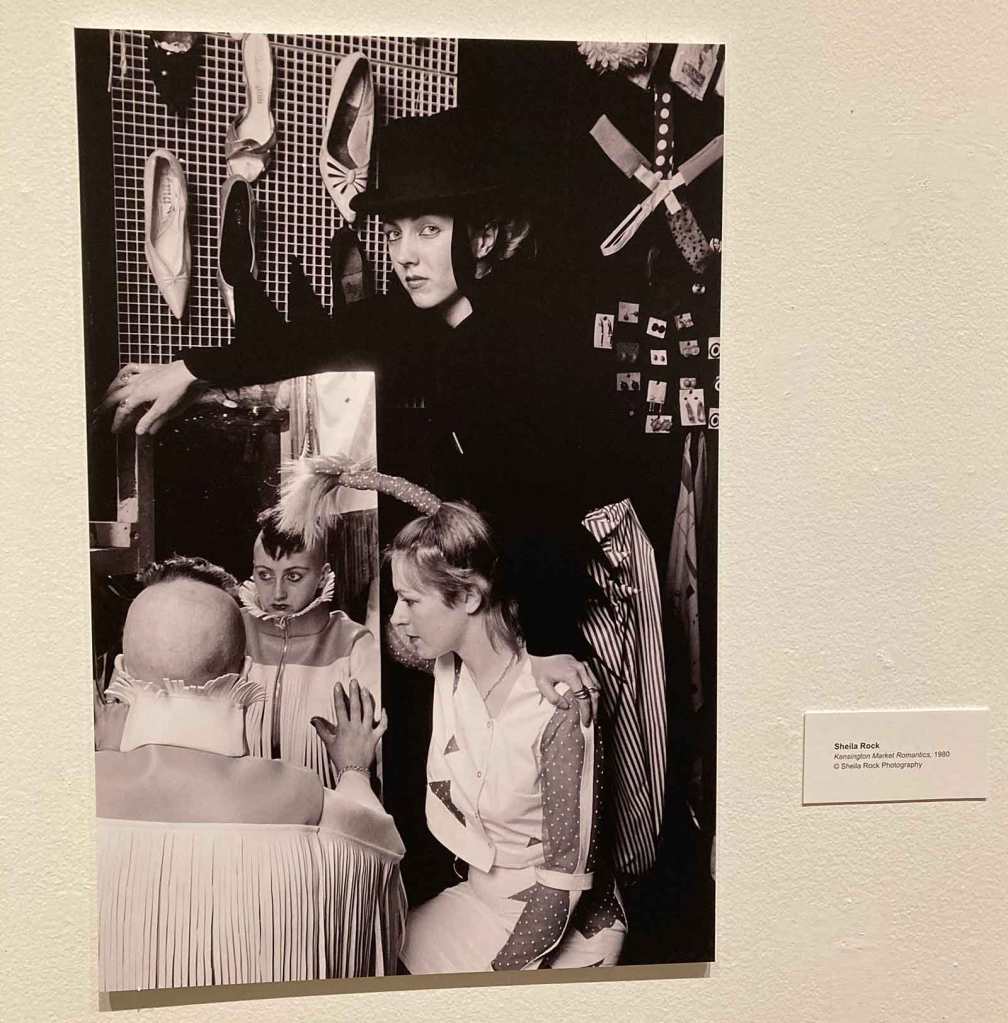
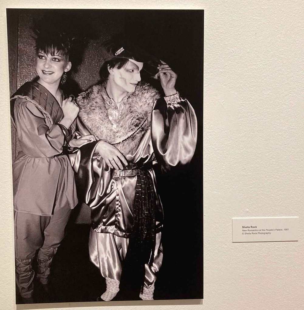
The Sheila Rock sub-gallery primarily showed her crucial photos from the New Romantic movement period on ’79-’81, and were in black + white. But the occasional color image was still there.
Don Letts + Jeanette Lee.The classic Blits Club image; used continually since 1979 showing every member of the first Visage lineup outside of the club.Arch poser Steve Strange going for decadence.New Romantics as shot at the Valentine’s Day 1981 concert at People’s Palace where Ultravox headlined. These New Romantics ran a shop at the Kensington Market. Site of the Simple Minds “Sons + Fascination” cover shoot.You could hardly tell famous New Romantics from the also rans. Also shot at People’s Palace Valentine’s 1981 show.
Looking back it’s hard to believe that Orlando was where all of this design had collected for public view. The records alone 45 years ago were hard enough to find! I managed to get a lot of these records in local store, but many was the time that the one copy I saw of something was something I snapped up to never see on sale again. When we hit the gift shop on the way out I was intending to purchase the first Krivine tome, now that I was reading the second one.And they duly had it there. $45 I was happy to spend. But they had more than that to buy!
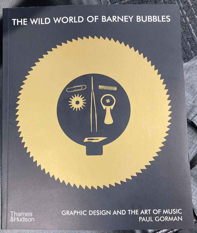
I had missed the “Reasons To Be Cheerful” book on Barney Bubbles over a decade ago. Back when I still bought from Amazon it could be had for chump change, but there were always record to buy first. Then for the last decade, OOP copies were a solid three figures! Yet I found the latest [most complete] printing at the show with a completely new look [and title] for only $40, so I pounced on it.
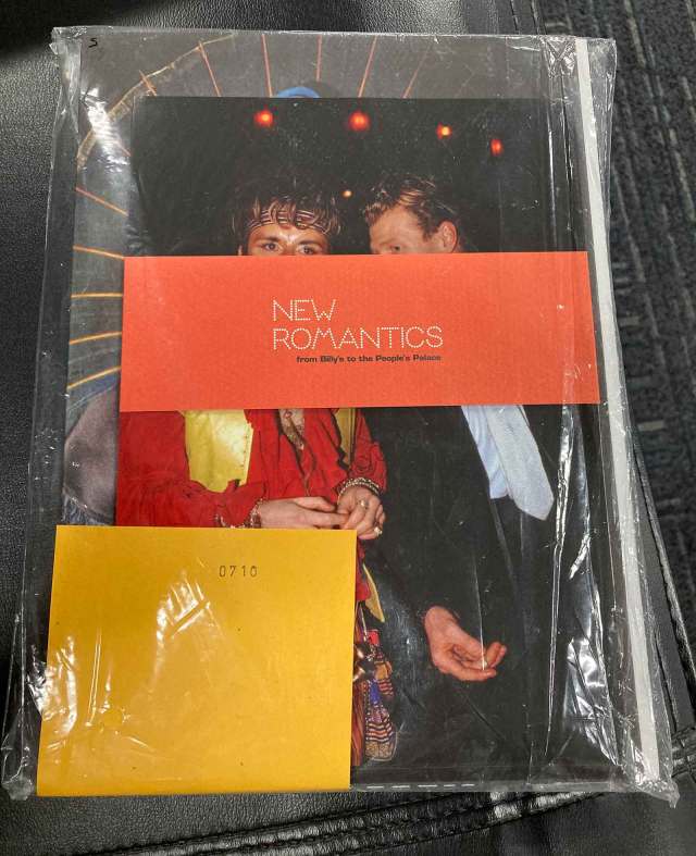
And finally, I had been aware of the French Sheila Rock signed/numbered edition of “New Romantics.” It was not prohibitively expensive but the postage from France always dampened my enthusiasm. Imagine my glee as I saw copies on a shelf within my grasp! The book came with a set of postcards, bookmarks, and two posters tipped into the cover. I ended up spending almost $150 [after taxes] on books this day. And I have been selling off my library for years with new additions coming in at a snail’s pace. But not this day.
I just finished reading Reversing into the Future today. I like Malcolm Garrett’s work overall, but I really love the What Do I Get poster–I’d never seen that one until today. I planned to fly to see this show in Denver (?) when it was there two years ago, and again when you wrote about the show a month or two ago, but decided the two books were a more more cost-effective way of seeing the work considering airfare from DC. Though certainly not as exciting as seeing in person–glad you got to go!
I also just finished the Barney Bubbles book a couple weeks ago–I’m glad they reissue it periodically because I picked up this most recent edition also.
Got the book – is great – and reading and looking at it now. Amazing to me how much US and UK influenced each other even in that non-internet age (there actually was an internet, however, only nerds/geeks like me knew about it :-) plus there wasn’t a universal TCP/IP networking backbone and fairly user friendly web portals (remember Mosaic and/or SlipKnot? Netscape came after that….))
Deserat – I was developing software from 1988 to 2001, but even when I had a computer in 1981 [Radio Shack CoCo] I never thought to buy a modem to get online. It never seemed important. I only got the internet [on a fat 256 kbps pipe!] in 1993 when we moved from Windows For Workgroups to NT 3.5 and there was Netscape. I have never even heard of SlipKnot until now!
Slipknow was for surfing the web and other BBSs over a modem connection (phone line – not TCP/IP network protocol…..Sloooooooooooooow :-) I wish I had bought a Mosaic t-shirt back then – great graphic!
AnEarful – Pouting ill becomes you! The Museum Of Art and Design got the first [pre-publication] “Punk Graphics, 1976-1986” art show way back in April 9 – August 18, 2019! Been there… done that!


![Want List: Visage DLX RM […finally!]](https://i0.wp.com/postpunkmonk.com/wp-content/uploads/2018/11/visage-dlxrmuscda.jpeg?resize=200%2C200&ssl=1)


I just finished reading Reversing into the Future today. I like Malcolm Garrett’s work overall, but I really love the What Do I Get poster–I’d never seen that one until today. I planned to fly to see this show in Denver (?) when it was there two years ago, and again when you wrote about the show a month or two ago, but decided the two books were a more more cost-effective way of seeing the work considering airfare from DC. Though certainly not as exciting as seeing in person–glad you got to go!
I also just finished the Barney Bubbles book a couple weeks ago–I’m glad they reissue it periodically because I picked up this most recent edition also.
Now on to Too Fast to Live!
LikeLiked by 1 person
Jon J – Then I wrote this post expressly for you! A fellow music/graphic design geek!
LikeLike
Argh – missed this show! But it looks like the two books by Krivine show a lot of what was in the show – is that so? I will probably buy those books….
LikeLike
Deserat – true, the show was a subset of the books, but still great fun to explore in real life and with real friends!
LikeLike
Got the book – is great – and reading and looking at it now. Amazing to me how much US and UK influenced each other even in that non-internet age (there actually was an internet, however, only nerds/geeks like me knew about it :-) plus there wasn’t a universal TCP/IP networking backbone and fairly user friendly web portals (remember Mosaic and/or SlipKnot? Netscape came after that….))
LikeLiked by 1 person
Deserat – I was developing software from 1988 to 2001, but even when I had a computer in 1981 [Radio Shack CoCo] I never thought to buy a modem to get online. It never seemed important. I only got the internet [on a fat 256 kbps pipe!] in 1993 when we moved from Windows For Workgroups to NT 3.5 and there was Netscape. I have never even heard of SlipKnot until now!
Oh yes, and the books are fantastic too!
LikeLike
Slipknow was for surfing the web and other BBSs over a modem connection (phone line – not TCP/IP network protocol…..Sloooooooooooooow :-) I wish I had bought a Mosaic t-shirt back then – great graphic!
LikeLike
It seems like this could find a good home for an exhibition in NYC…a man can dream, anyway! Looks fun and fab.
LikeLiked by 1 person
AnEarful – Pouting ill becomes you! The Museum Of Art and Design got the first [pre-publication] “Punk Graphics, 1976-1986” art show way back in April 9 – August 18, 2019! Been there… done that!
LikeLiked by 1 person
Ah, well, that’s life in the big city!
LikeLiked by 1 person