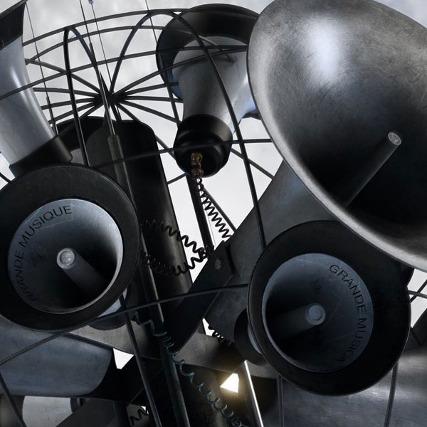
ALBUM 21: Big Music | 2014 | designer: Peacock
Of course, there was also a deluxe edition box with a second CD, DVD, and poster in the usual EMI box [which probably has a name, I need to research this]. Given that this sold for a modest £14.99, and featured more music and stuff, it was a no-brainer for me. The box was covered in a much more elegant foil-stamped treatment. It was still beholden to the muse of Depeche Mode, but was far more impressive than the CGI artwork, which at least was hidden within the packaging.
The back cover of the standard CD became the front of Disc 2, featuring six more tracks. The third disc was a DVD and featured a photo from the video shoot that was featured on the DVD within. This was the only instance of backing vocalist Sarah Brown depicted in the packaging, but it also featured pickup member Catherine AD, who appeared in the music video for “Honest Town” as seen on the DVD. The latter had not appeared on the album as recorded, but was only in the video.
The artwork on the back of the card sleeves bears mentioning. each of the card sleeves used to house the individual discs [CD2, CD2, DVD] have a somewhat puzzling image used as a background for the disc copy revealing the contents.
It looks like just a scratchy surface of some sort, but 3D mavens will recognize this as the texture map used on the loudspeaker horns prominent on the front cover image. The radially scratched surface image gave the horns a varied, and slightly weathered look. What was also apparent from close examination of the cover image, was that the words “Big Music” in a number of languages was also written on each of the smaller loudhorns in the image.
You would have needed a printer’s loupe to see this on the CDs. I didn’t even notice it at first. You might wonder what is the point of putting such detail into a cover image that is only 4.8″ square, but that wouldn’t take into account the LP version of the album.
Of course, it’s one of those 2xLP, 180g format [with download code] releases that mean so little to me. But at least you can discern the text detail on the loudhorns featured on the cover. The twelve CD tracks were doled out three to a side here, and I’m guessing that more than 800 copies of this left the pressing plants. Just a hunch. Of course, the quality of the sound could be anything. Today’s vinyl is not exactly pressed with the same care that previous generations [using the same equipment – no new presses have been manufactured in a generation or two] may have brought to the process. To get a bracing glimpse into the world of modern record production, I recommend this story on The Quietus.
Simple Minds have had quality all over the map with their releases, but generally, their imperial period [’79-’84] stands the test of time with the Malcolm Garret work, in particular, for their 1981 releases being of an exceptionally high standard that has dated only in that it reflects quality no longer common in this fallen world. But even Garret produced the cover art to two of my least favorite Simple Minds albums [LITCOL, SFY] so caveat emptor.
Their penchant for having a faceless image with almost no photos of the personalities on the packaging of their albums has been a distinct trait that has been shared with many of my core collection bands. This is probably down to the fact that either arch-designers Malcolm Garrett or Peter Saville designed the covers to said groups records! Their recent artwork tends to be busy and workman-like, or else it trades on their past iconography as if they are afraid to venture too far out of line with the branding that they imagine their audience is willing to accept. None of it attains the class of their imperial period, but I could say the same of the music, which is rather good in many instances. The overuse of the claddagh image has been a particular thorn in my side. Especially as it references some of my least favorite work by the band. I would prefer that the band move forward with new branding that doesn’t trade on their past and reflects the extremely different band that they now are almost 40 years onward.
Next: …The last word


![Record Shopping Road Trip: Visiting Liverpool + 81 Renshaw Records [Liverpool, England]](https://i0.wp.com/postpunkmonk.com/wp-content/uploads/2024/05/liv-81-renshaw.jpg?resize=200%2C200&ssl=1)
![Record Shopping Road Trip: Cob Records [Porthmadog, Wales]](https://i0.wp.com/postpunkmonk.com/wp-content/uploads/2024/05/cob-welsh.jpg?resize=200%2C200&ssl=1)
![Record Shopping Road Trip: 58th Mega Record & CD Fair [Brabanthallen in ’s-Hertogenbosch, Netherlands] [part 2]](https://i0.wp.com/postpunkmonk.com/wp-content/uploads/2024/05/rw-icehouse-floppy.jpg?resize=200%2C200&ssl=1)
![Forty Years Ago Today, Simple Minds Changed Everything with "New Gold Dream [81,82,83,84]"](https://i0.wp.com/postpunkmonk.com/wp-content/uploads/2022/09/new-gold-dream-in-spotlights.jpg?resize=200%2C200&ssl=1)