
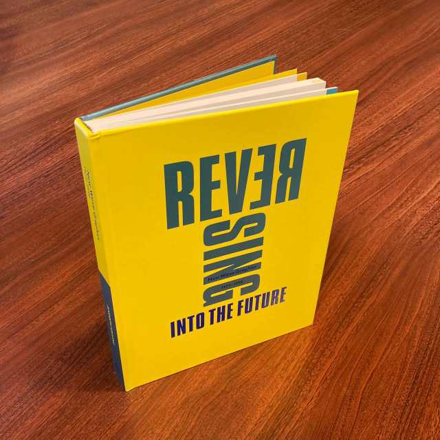
Andrew Krivine: Reversing Into The Future – New Wave Graphics 1977-1990 – UK – hardcover [2021]
Andrew Krivine laid the cards on the table. He had intended for a New Wave section in the “Too Fast To Live, Too Young To Die” tome we looked at yesterday…but then the book would have been 700 pages long! Any one of these volumes is as much as you want to lift up to read. The heft actually makes my hands hurt when I do that! In the indicia Krivine revealed that from contract to delivery, the creation of this book took a mere 53 days to complete. That was down to the clean design framework by Barbra Doherty and Mal Peachey for the earlier book. That …and the notion that all of the images had already been processed for the earlier volume before the smart decision had been made to spin them off into a separate book! If I had to scan and retouch the 500+ images here we might still be waiting for the publication. I once designed an art book a fraction of this size that took many months.
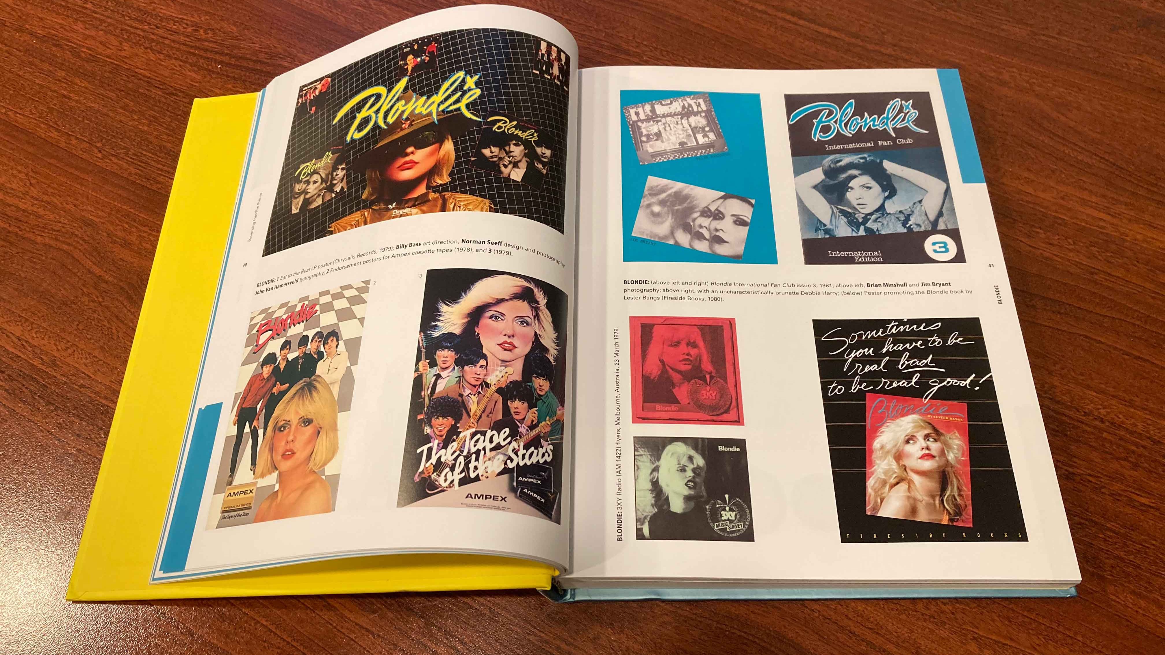
The layout of the book is split between US and UK New Wave acts, with the few outliers from elsewhere included in with the UK grouping because, apart from New Zealand’s Split Enz, who were Art Rockers anticipating New Wave until that moment where they became one with it, there’s not a whole lot of material here from outside of the AngloAmerican sphere. The organization plows through the alphabet in band names from A-Z in both cases for a streamlined approach. Sensible. And I’m not invoking The Captain.
WHAT DOES ‘NEW WAVE’ MEAN TO ME?
Like the first book, it’s enlivened by essays that cut through the images to provide food for thought. Design icons like Malcolm Garret and Chris Morton [C. More Tone] dd their professional insights into the mix and philosophy academic Pete Groff does us all a favor by attempting to parse the meaning of the nebulous marketing term “New Wave” with some insights that manage to have some stickiness after the fact. I’ll just quote the last paragraph of the zesty text below since it’s perhaps the crux of the entire book.
“You could say that when Punk and New Wave went their separate ways in 1978, New Wave got the better end of the deal. Punk kept the hog’s share of the energy, anger, volume, and cathartic rush, but it grew increasingly brittle, earnest, ascetic, puritanical – obsessed with its own righteousness and authenticity. New Wave took the intelligence, the playfulness, the openness, the free spirited bricolage, the Apollonian irony, and yes, the fun. Don’t get me wrong; there’s a lot of amazing Punk that got made after 1977. But take the ten best slabs of Punk from 1978-1982 and put them up against your top ten New Wave songs: which makes you feel more alive? My money’s on New Wave.”
Pete Groff in “What Does ‘New Wave’ Mean?”
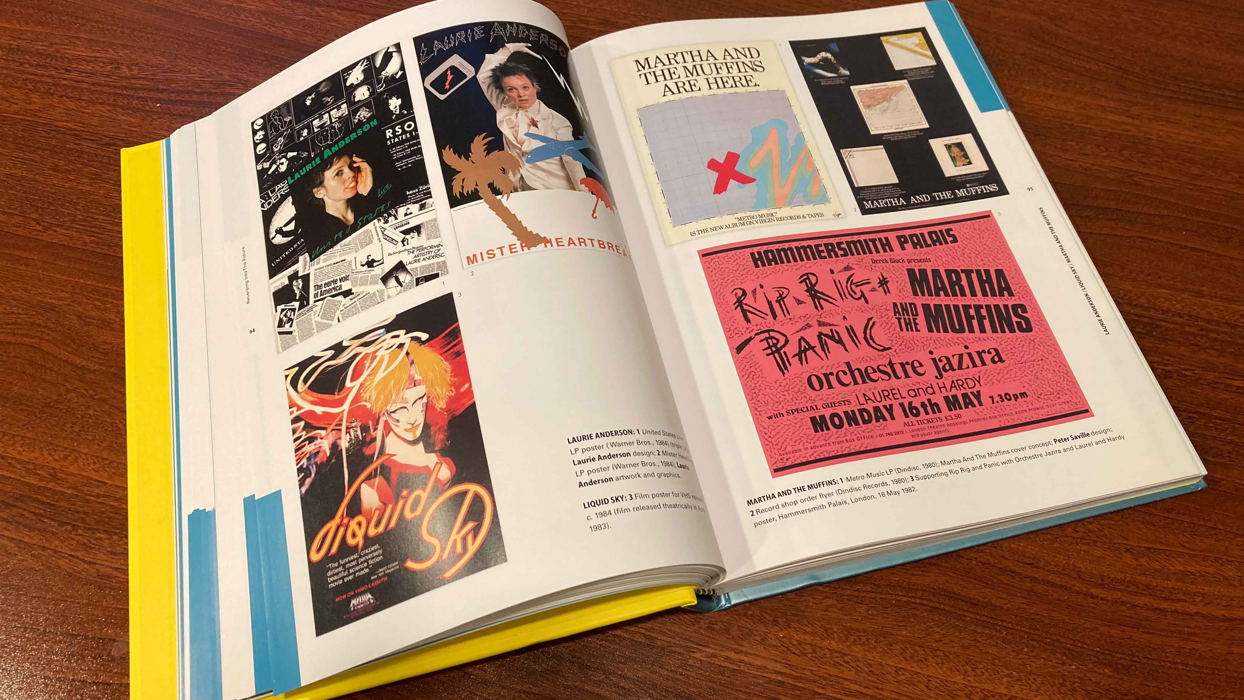
Laurie Anderson was a visual and performance artist who was poised to take the energy of New Wave and apply it to her conceptual work and really broaden her audience. She went from press coverage in Artforum to the NME in the space of months thanks to John Peel playing her self-released 7″ single on his BBC show. No one was probably more shocked than her to find that her Art Pop single “O Superman” became a triumphant #2 single in the UK in the holy year of 1981, where what I consider New Wave crested most impressively in the UK.
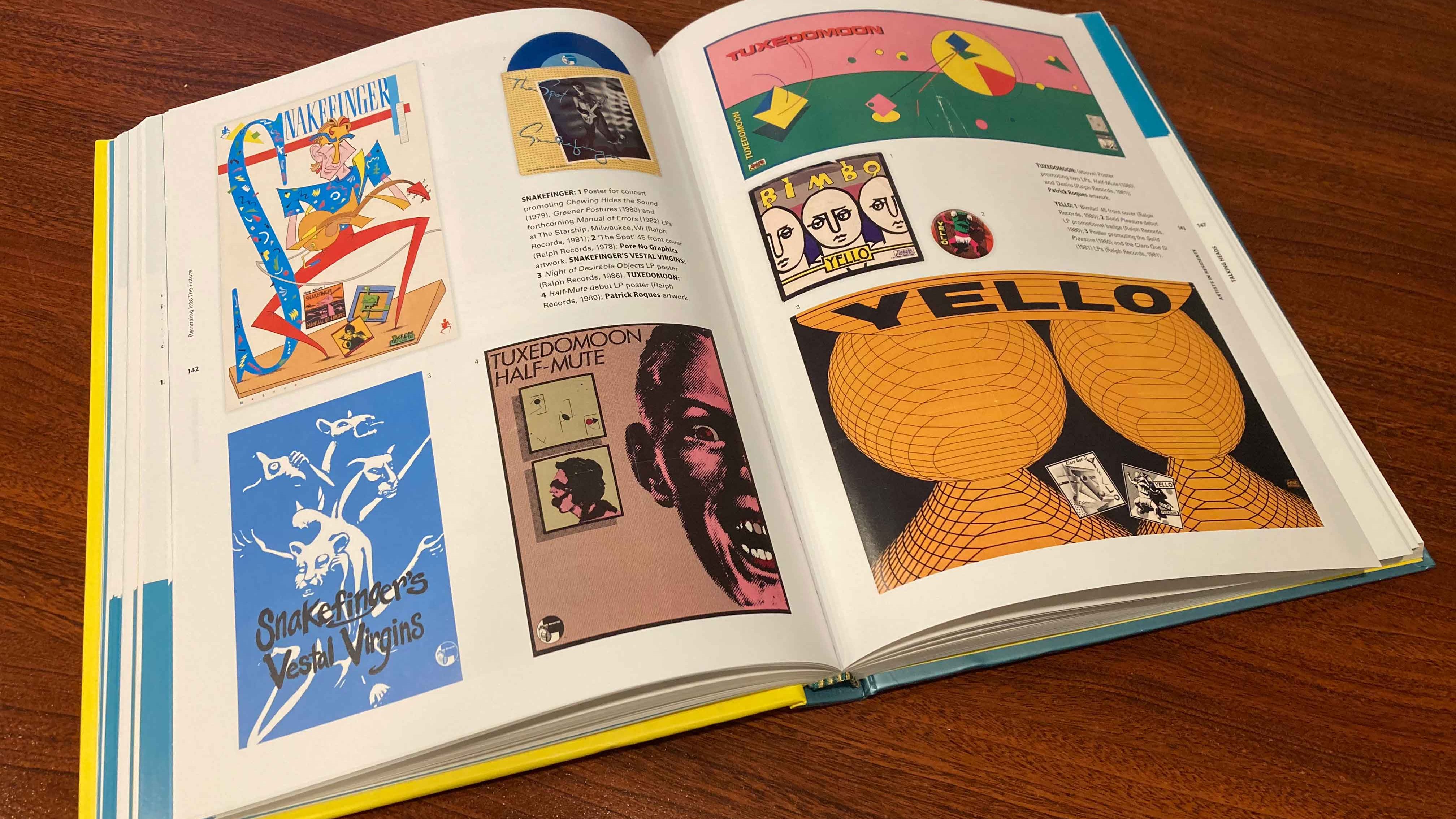
I was happy to see that the inventive minds at Ralph Records got a deep dive in this book as their entire oeuvre was Proto-New Wave in every sense of the word. From music to packaging. One gets the idea that their efforts helped to midwife the very movement itself from their decidedly outsider bearings.

Ze Records brought a NYC sensibility and a vision beyond neurotic white men to expand New Wave’s gene pool with AfroCuban influences and plenty of room for women. Disco was always raw material to be folded into the broad New Wave scene and the Ze vision gave artists like August Darnell, who was ultimately more idiosyncratic than a production medium like Disco had room for, a way out of Disco’s cul-de-sac. And critically, allowed the DNA of Disco to propagate after its sell-by date.

There was room in the New Wave pool for plenty of people to splash around in. We all thought that Bill Nelson was a Prog Rocker by virtue of his guitar playing prowess, but time revealed him as being an Art Rocker, and thus more adjacent to New Wave. By the time that Be Bop Deluxe had their last hurrah with 1978’s “Drastic Plastic,” the modernity of the band’s music and even image had nothing to do with their Glam Rock origin time. Though Glam Rock was always a useful antecedent to New Wave. Just ask David Bowie who never got rejection from the Punks, unlike so many other established stars.
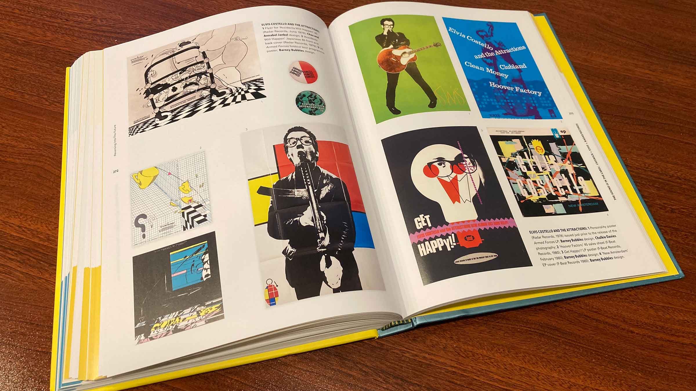
The value of Stiff Records to New Wave cannot be underestimated. The ex-Hippie, Pub Rockers who started the label nevertheless had Post-Modern attitudes that were screaming for a venue that the New Wave they helped birth provided. With in house designers Chris Morton and Barney Bubbles, the label was well-poised to help midwife the burgeoning New Wave scene. With wiseguy graphic nous married to the equally pungent pen of Elvis Costello, soon we all had a sense of what this New Wave was all about.

One can hardly scream “NEW WAVE!!!” louder than Joe Jackson’s “Beat Crazy” cover, even though the artist himself was probably done with “New Wave” by the time this album as evidenced by that album’s back cover photo and defensive liner notes. Jackson’s pivot to…40+ year old Swing music as his next move cemented his curmudgeon status a full decade too early for the 90s Swing trend that followed in his wake, but I’ll bet that suited Joe.
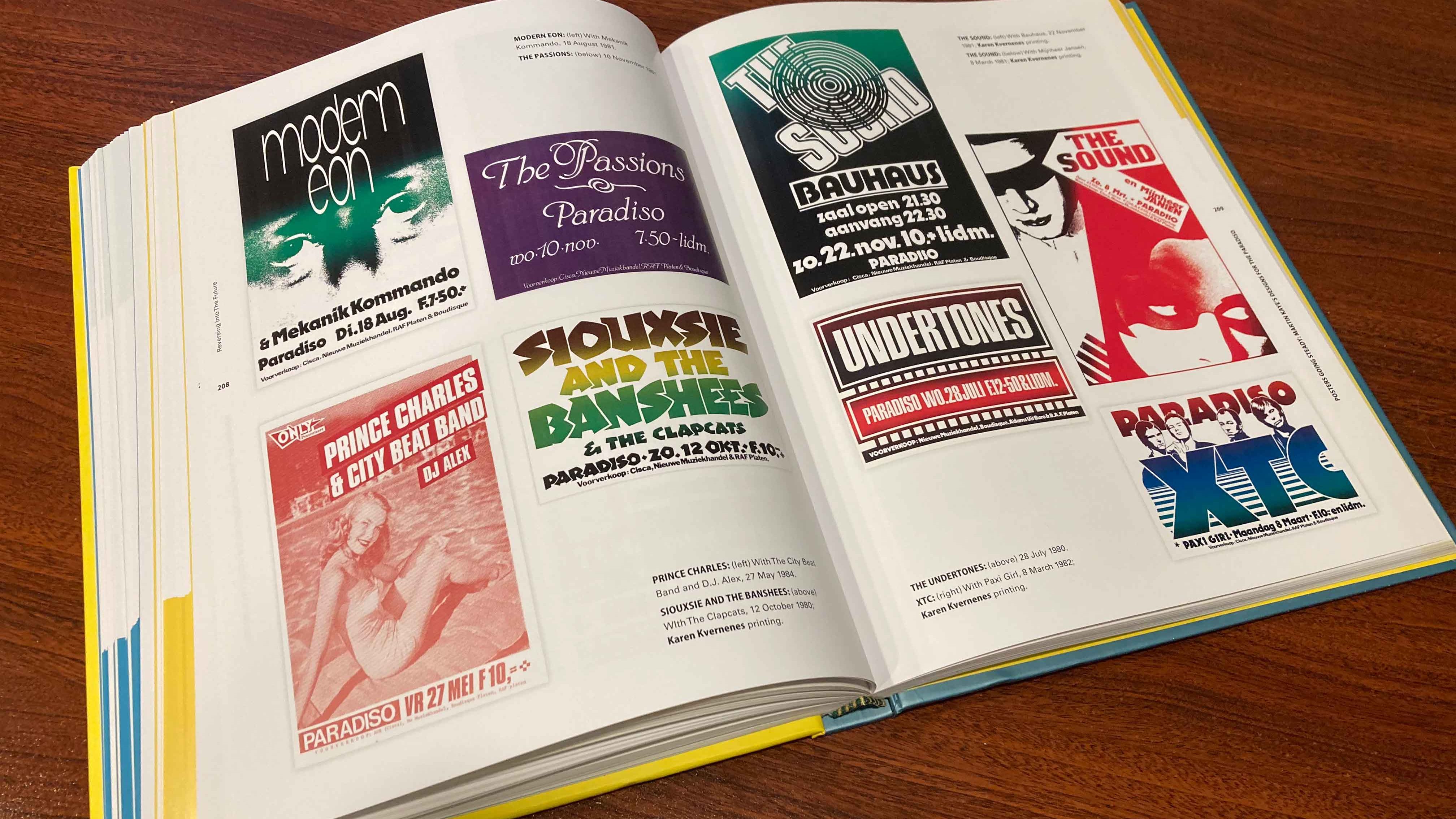
Since I wasn’t trying to collect New Wave graphics at the time; I just wanted to hear the music, I didn’t know about the original posters for all of the New Wave acts playing at Amsterdam’s Paradisio made by serigrapher Martin Kaye. The largely hermetic work in most cases made no concessions to existing act iconography and took of frequently from a strictly typographical perspective owing to the high speed, high volume demands of concert poster art. I saw many of these in the art show I saw from this collection last February, and the split fountain color vignettes were highly distinctive.

Malcolm Garrett began his essay in this book with a look at the 1977 Vertigo compilation simply called “New Wave” as his entry point to the term itself. Noting his suspicion of it as a Punk Rock fan, with the whole, tired “New Wave was a watering down of Punk” trope we’ve all heard. Yet acknowledging that it was with New Wave that he became most firmly entrenched. As he put it, “a member of the band” in the cases of The Buzzcocks but also Duran Duran, and Simple Minds. The latter band’s greatest visual triumphs, via Garrett himself ca. 1981, were conspicuously absent from the book. Strangely enough. Though a “Sparkle In the Rain” poster did figure in its pages. That album always struck me as an attempt to hybridize the approaches that Garrett first brought to “Sons + Fascination” followed by “New Gold Dream” into a synthesis that never quite fit the music inside in the way the preceding albums did.

One provocative aspect of the book was that it carried the New Wave well past the mid-80s where I would mark its cut-off point, through to 1990. Significantly, this allowed for clearly New Wave leaning acts like Sigue Sigue Sputnik [whose provocative creator Tony James came from Punk’s Generation X] to have a berth for their increasingly out of sync with the zeitgeist vibe. Nobody was more Post-Modern than SSS in the increasingly drab late 80s.
This second volume was more coherent than the sometimes sprawling first volume. There was no point like where the first book’s stretching to include American Hardcore didn’t quite work for me. Instead, this was a more flowing collection that captured the gist of its title more accurately. For a deep dive into all of the records and bands you might not have room for in your own Record Cells, the volumes are must-haves for any New Wave library. I’m so happy that my friend Tina gifted me with this book and that I was able to buy its companion volume under what were the best circumstances possible. Seeing much of their contents live in an art museum with good friends with me that day!
-30-


![Want List: Visage DLX RM […finally!]](https://i0.wp.com/postpunkmonk.com/wp-content/uploads/2018/11/visage-dlxrmuscda.jpeg?resize=200%2C200&ssl=1)


Greetings from the UK and many thanks for today and yesterday’s posts. I was unaware of the books before, but having grown up with this music in the late ’70’s and early ’80’s, I remember all the records sleeves and graphics from the NME and The Face.
I have managed to order what is described as a “like new” copy of the second book from eBay for £11 (about $15), so I should hopefully receive it in the next few days. The first one seems to be more expensive, so I will probably wait and see if it’s worth getting a copy.
LikeLiked by 1 person
Roy Solomon – I preferred the second book but your mileage may vary. The pair comprise a fairly comprehensive set. And there may one day be mass market paperback editions to ease the cost, but with those would no doubt come “perfect binding” and copies that shed their pages when the hot melt glue dried and ossified. At least the hardcovers have real binding and should last the rest of your life. [Monk crosses fingers]
LikeLike
I much prefer hardback versions of this type of art book. New copies of the first one are available, but they are at least £26 ($35). There don’t seem to be any second copies at a more reasonable price just now, but I will keep looking.
LikeLiked by 1 person
Ray Solomon – That’s still better than the discount price of $39.99 I paid ($5 off list price) that I got as a discount for buying it at the art exhibit. But I hear you. I try to buy no books a5ball but in the last year I’ve bought at least six that I have almost no time to read. It’s taken me from September of last year until now to read these two art books! I’ve got so many things I have to do with my downtime I’m afraid reading is low on the totem pole.
LikeLike
I love seeing the Liquid Sky film poster, not that it is so unique (though the film itself is very!), but just the fact it is in the book! Thanks Monk!
LikeLiked by 1 person
Fantastic post. I have to get these tomes!
I actually saw The Sound at Paradiso in Amsterdam in the mid-late 80s! I may have mentioned that to you before when we met up in that fine city.
Great to see some Sputnik in there too.
LikeLiked by 1 person
I have bought the hardcover edition!
LikeLiked by 1 person
gavinthemetamorph – You won’t regret it, friend! Look out for the very quirky Toyah @ The Paradisio poster in the “Reversing Into The Future” volume.
LikeLike
gavinthemetamorph – The Netherlands were the biggest market for The Sound. A band I have shamefully not heard yet! SSS were possibly the most New Wave thing going in the mid-80s! Tony James carefully considered so many angles there.
LikeLike
I ordered a used copy today. Seems like a fascinating read. I wonder if Peter Saville or Factory is included ? Thanks for the tip Monk.
LikeLiked by 1 person
Jordan – Saville and Factory figure prominently in the first volume, “Too Fast To Live, Too Young To Die.”
LikeLike