

Andrew Krivine: Too Fast To Live, Too Young To Die – Punk And Post-Punk Graphics 1976-1986 – UK – hardcover [2020]
I had written about this book when I got wind of its imminent release in five years ago. While a lot has happened since that time, buying the book wasn’t one of them! Yet, when I found myself at the fourth museum show built around the Andrew Krivine collection of music design and ephemera, I went here with the thought that I could finally get this book! Sweetening the pot was the fact that a good friend had gifted me the follow up tome, “Reversing Into The Future – New Wave Graphics 1977-1990.” The second volume had appeared in 2021, shortly after the first volume’s publication while I was obviously not looking!
After that trip to the Orlando Museum of Art, I came home with the previously missing first volume, as well as several other music design volumes deemed must-haves for the Record Cell library. Today we begin reviewing the two Krivine books. The first volume was a large, heavy hardcover with hundreds of graphic design examples, both iconic and obscure. The book opened with the American Proto-Punk contingent so the beginning of the book featured The Velvet Underground, Reed + Cale solo, The New York Dolls, Patti Smith, Television, The Heartbreakers, and of course, Iggy Pop.
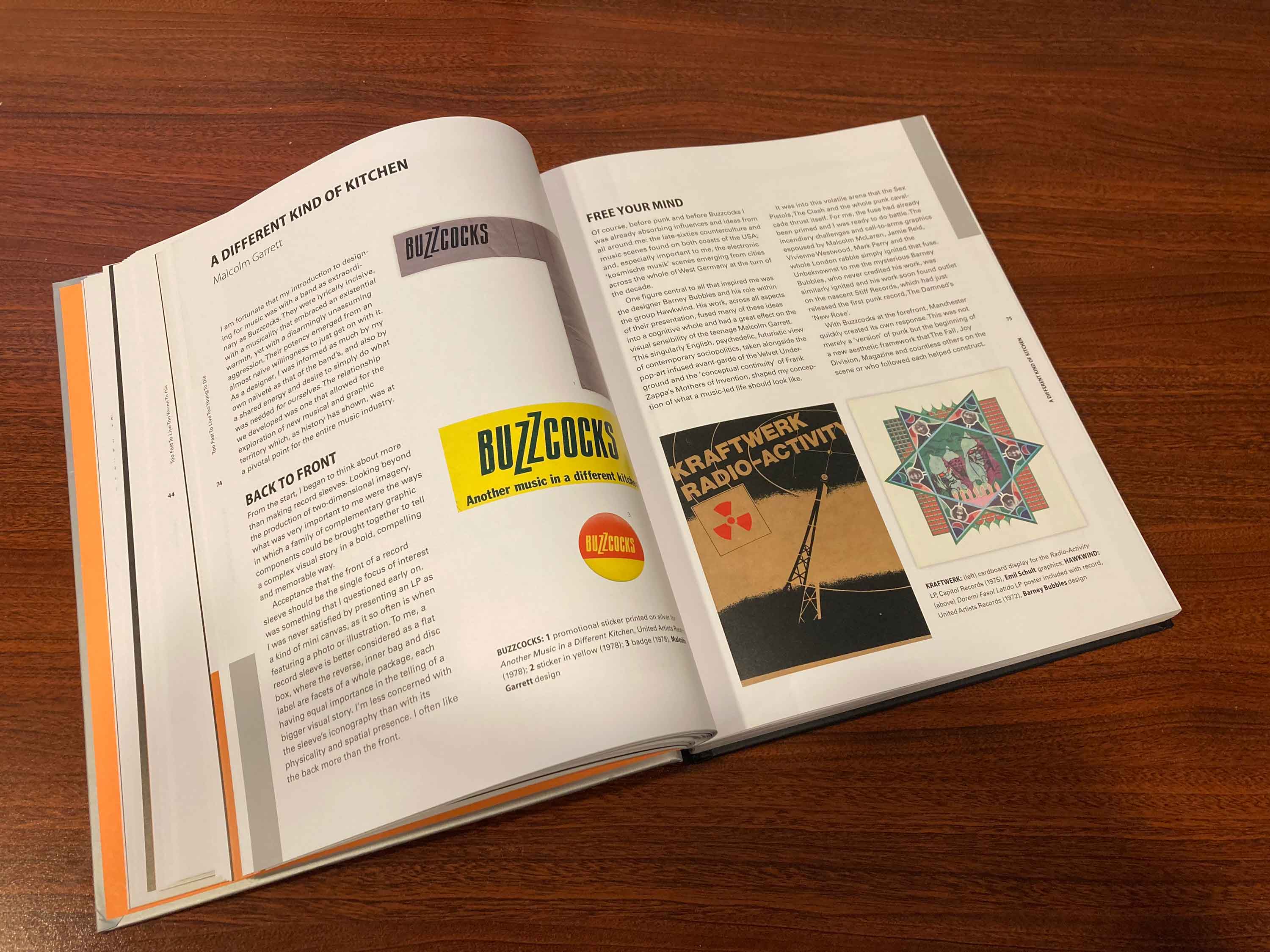
The book was more than well curated eye candy. There are also several essays accompanying various sections of the book where guest writers weigh in on their various areas of expertise in regards to the contents. None more cogent than that of designer Malcolm Garrett who was intrinsic to the field of graphic design itself and brought his very personal observations to the text he contributed.
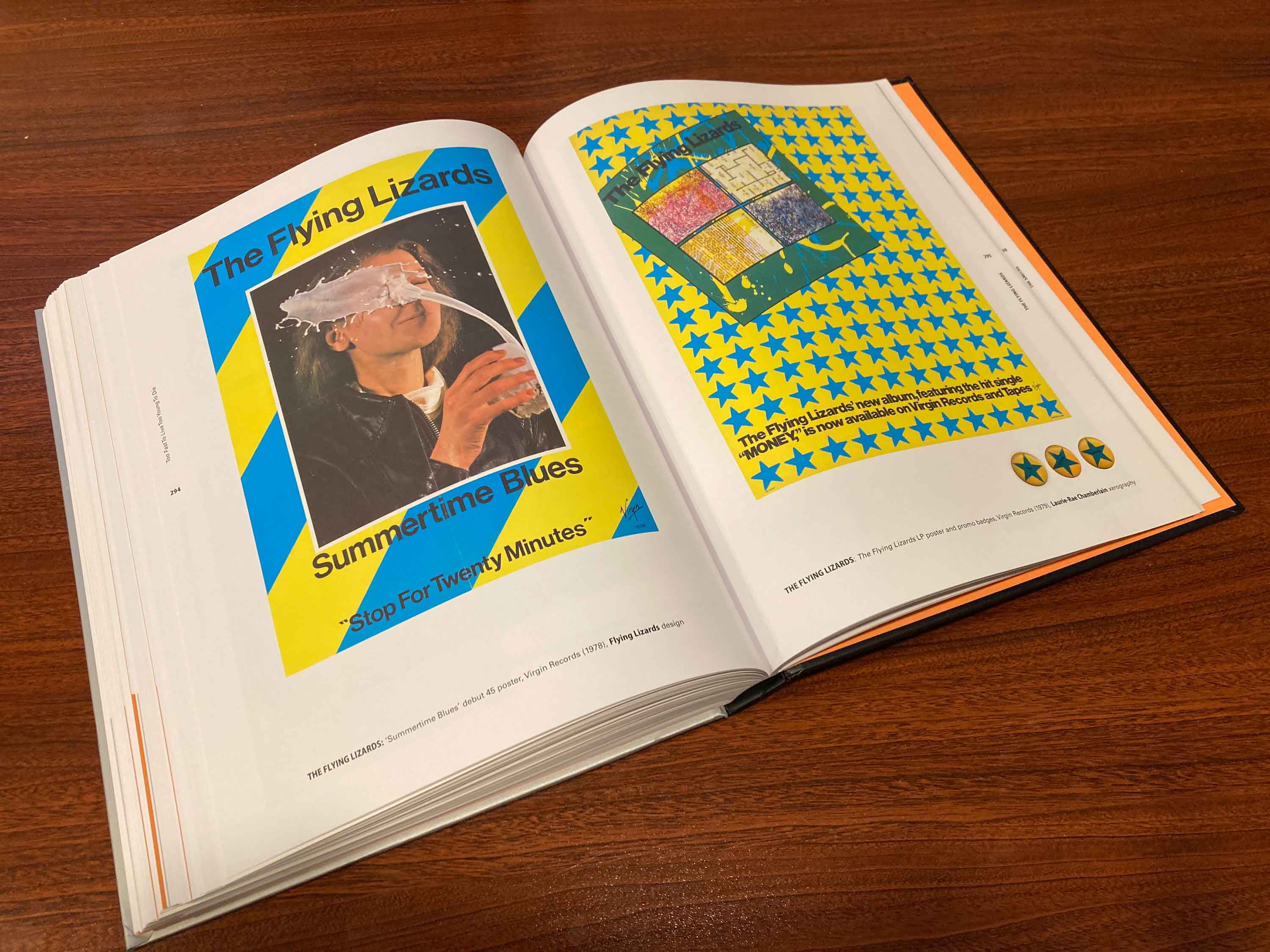
The Flying Lizards were drenched in Fine Art but gained a commercial foothold via their New Wave Novelty cover of “Money” which was surprisingly ubiquitous in the initial salvo of the New Wave scene in 1978. For a time, anyone could point to this music and design as being at the forefront of whatever New Wave was said to be.
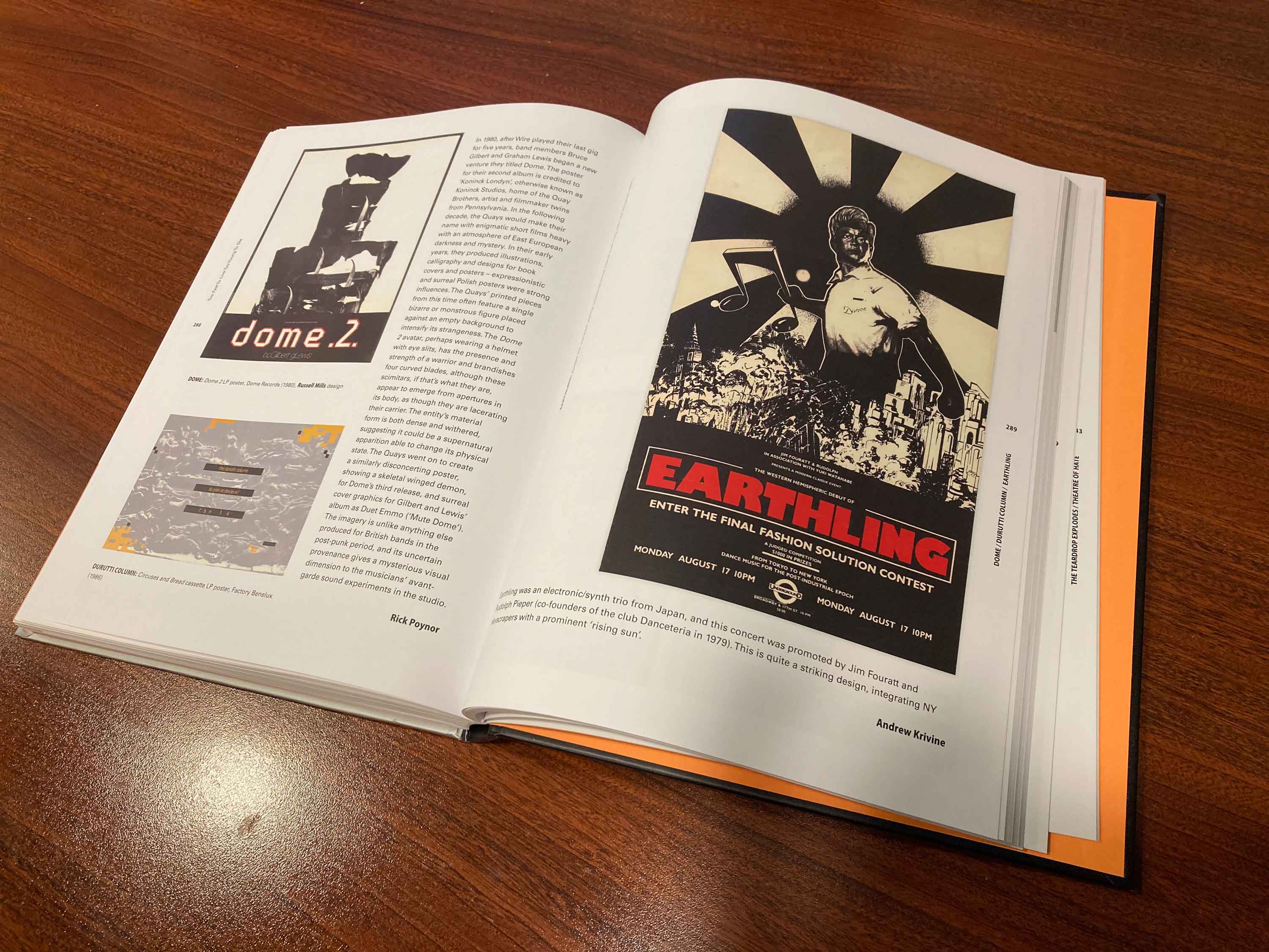
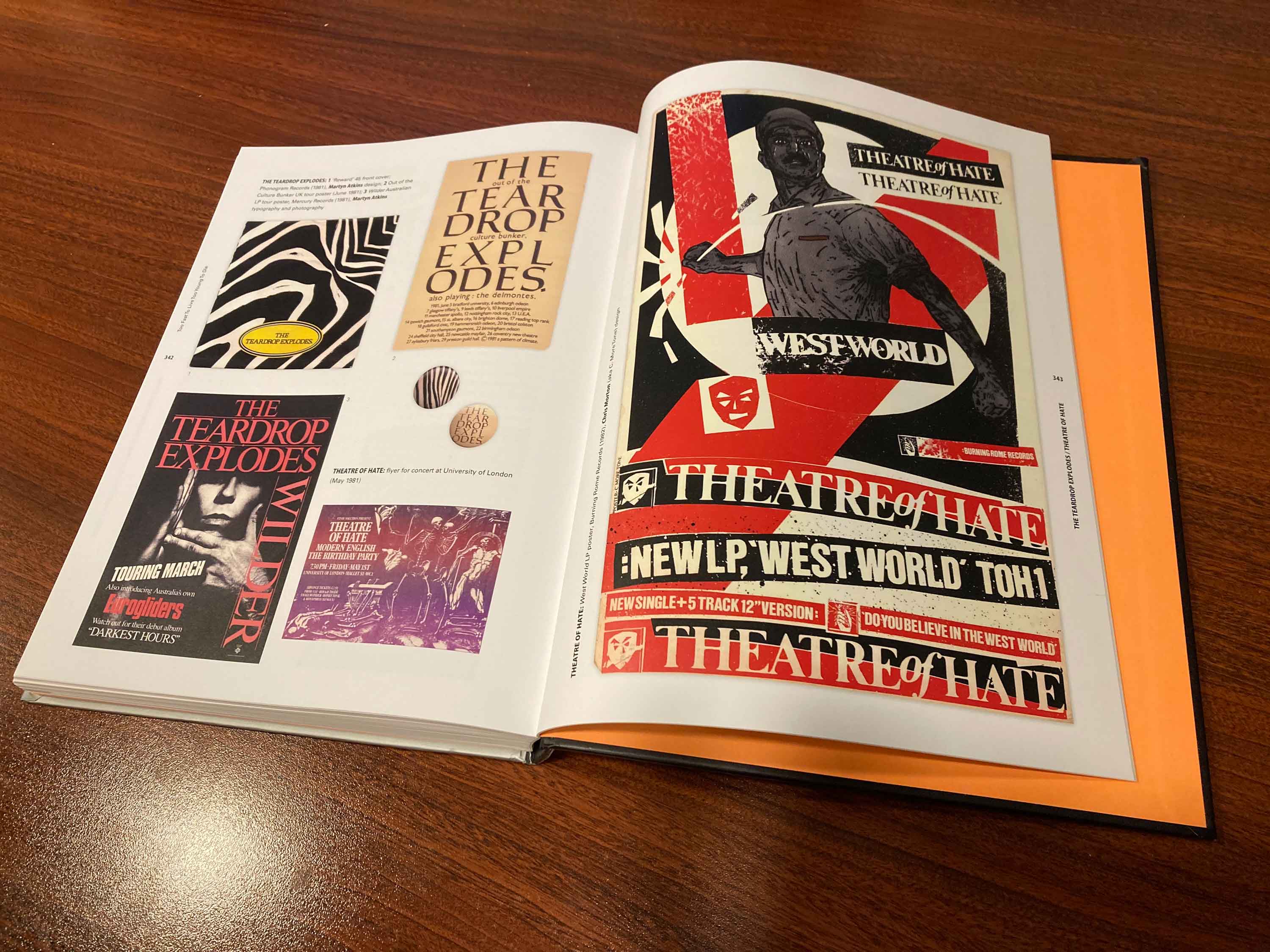
One of the fascinations of the book was that it was large enough to feature discreet examples which though years apart, obviously featured the same artistic reference points. I’ve had the Theatre Of Hate’s 1981 album “Westworld” [as designed by C. More Tone] and the cover featured a doctored photo of a figure whose origins I never knew. That very same image was also the reference for the poster for the Japanese band Earthling in a poster where it was also used for a 1981 concert poster; albeit with a babyhead. Both used the classic red/black/white color palette.
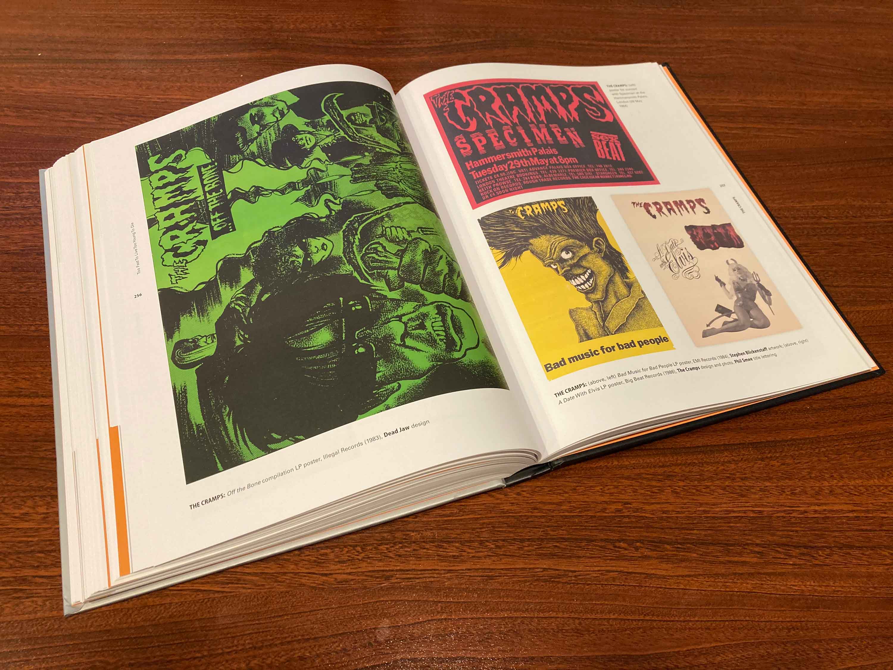
While the book featured what felt like an equal complement of US/UK bands and images, I was heartened to see The Cramps figure prominently. Both as an influence on the lowbrow kitsch art referenced continually in this sphere, but also as a formative influence on the Batcave scene which birthed the Goth movement. The essay by Michael Wilds, wherein he met Bryan Gregory and Lux Interior of The Cramps on the late night streets of NYC with a mutual friend providing the social glue even before he saw them actually play a concert.

Jamie Reid’s Situationist derived design for The Sex Pistols must surely have a coffee table book of its own by now, right? But since I don’t have it, seeing the brilliant “American Express” ad parody for “The Great Rock + Roll Swindle” was a real eye opener that this book provided.

The chapter on The Batcave scene heavily featured Bauhaus but the cultural divide was present on the copy under the Chicago Metro flyer for the band. The writer found the Japanese Kamikaze attack theme at odds with the band’s established imagery, but maybe they didn’t realize that the show date of December 7th was Pearl Harbor Day in America. Which is fair, since I couldn’t tell you when Guy Fawkes Day happens in the UK off the top of my head either.

Punk bands that followed close on the heels of the Sex Pistols, had the bar raised for graphic language sophistication and The Clash rose to the occasion with their own manager-slash-provocateur in Bernie Rhodes. Who oversaw the band’s marketing and creative directions.

Even lower ranked Punk bands like Generation X could get the uplift that a Barney Bubbles designed sleeve or poster could afford such up-and-comers. The Constructivist style Bubbles favored here was a very fecund field for graphic appropriation. Ironic in that its ageless modernity went back over fifty years.
If this book has any weakness it might be this one. The editorial decision was made to include the US Hardcore scene. Maybe it’s my musical boas showing, but it always seemed to me like a very separate scene to my eyes and ears. The next generation. While I can see the parallels between Raymond Pettibon and Black Flag or Winston Smith and The Dead Kennedys to UK analogs like Malcolm McLaren and The Buzzcocks or Jamie Reid and The Sex Pistols, the Hardcore era is steeped in a low-rent aura that frankly the Punk and Post-Punk eras were trying their level best to avoid. First Wave Punk was confrontational, but slick.
Other than that concern, this was another great addition to the Graphic Design bookshelf in the Record Cell. Tomorrow we’ll be casting an eye at the even better sequel that delves heavily into the New Wave scene which was even more sprawling as we cock an eye at “Reversing Into The Future: New Wave Graphics 1977-1990.”
-30-


![Want List: Visage DLX RM […finally!]](https://i0.wp.com/postpunkmonk.com/wp-content/uploads/2018/11/visage-dlxrmuscda.jpeg?resize=200%2C200&ssl=1)


In an adjacent world the Paul Reubens documentary airing right now gives some time to LA punk scene artist Gary Panter.
It’s a good documentary overall if Pee Wee Herman is up your alley. I felt rather old watching it, brought back memories of watching the show with my oldest son.
LikeLiked by 1 person
Tim – We already saw that documentary. Rather fascinating. Pee-Wee Herman came to my consciousness via that fantastic 1981 HBO stage show presentation. What I consider “Pee-Wee Prime.” I enjoyed the surreal Letterman appearances, and I saw the first movie but then got off the bus. Seeing that first movie was a harbinger of things to come. My friend and I were astounded to be in a theater full of children for it! I always thought of PWH as a commentary on childhood for an adult audience.
LikeLike
That book looks incredible. So many great pieces of artwork, several of which are in my record collection just from the images you have displayed.
I will have to put it on my endless want list…sigh
LikeLiked by 1 person
gavinthemetamorph – It’s 350 pages of well curated goodness. I might have 5-8% in the Record Cell. I had a few of the posters, now gone. This book will be lasting. The next volume for today’s post I rate even better!
LikeLike
Pingback: Andrew Krivine’s “Reversing Into The Future: New Wave Graphics 1977-1990” Covered The Often Fine Distinctions Between Punk, Post-Punk, And New Wave Design | Post-Punk Monk