
[…continued from last post]
The last post examined a single that graphic designers Malcolm Garrett and Peter Saville had collaborated on together in 1981 for Duran Duran. Today we’ll examine a more substantial pairing of the two Mancunian designers who have separately determined the coloration of large swaths of Punk and Post-Punk record sleeves. Just Garrett’s work for The Buzzcocks and Saville’s for Joy Division would be sufficient to mark their influence for all time. But there was so much more to speak of.
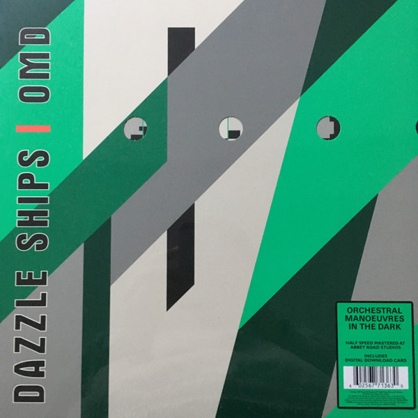
EXHIBIT B: OMD • Dazzle Ships [1983]

The next time I saw the two work together was on the amazing “Dazzle Ships” project in 1983. This one had the whiff of more Saville than Garrett owing to his close relationship with OMD which saw him encountering some Edward Wadsworth paintings at a show featuring the Vorticist Movement in an art museum. He was particularly enraptured by the painting “Dazzle Ships In Drydock, Liverpool.”

As almost anyone would be! I’ve had the occasion to view a Vorticist show in a museum myself and that hundred year old movement hasn’t lost any of its potency! Saville mentioned this to history buff Andy McCluskey who found the WWI navy camouflage an ideal visual counterpoint to the exploration of international conflicts that their new album was shaping up to become.


“Dazzle Ships” was OMD’s follow up to their career-defining “Architecture + Morality” which sold enormously well. Their label switched from Virgin subsidiary DinDisc to Virgin proper with this album, and the budget was probably very lassiez faire. The last album had had a die cut, but “Dazzle Ships” would be a die-cut gatefold cover that reflected the intricate geopolitik nature of the songs with the reference to the WWI era battle cruisers in seaborne camouflage.
The front of the sleeve had circular portals as in the ship’s hull showing the inner gatefold as in the large sleeve above. The front panel was a single gatefold sheet that opened to the left and revealed the inner gatefold. The inner right gatefold also had a series of smaller holes in a sine wave pattern, as if tracing satellite orbits onto the time zone map of the world depicted on it. Then, the color of the inner sleeve, resembling maritime signal flags in yellow and salmon, would be visible in the inner gatefold where the die cut sine wave holes were. The sleeve became an animation when the listener removed the inner sleeve from the gatefold cover. As shown below.

The inner gatefold when removing sleeve – click for larger
It bears mentioning of all the territories releasing this album, I can only find the die cut gatefold sleeve on the Spanish and [how appropriate] Yugoslavian pressings! And if either of those territories had the second die cut on the inner gatefold as shown above is unknown. I was lucky enough to have found a copy of the UK 1st pressing at Fantasyland Records in Atlanta about thirty years ago. It staggers my mind that with all of the notoriety and spotlight that had seen this misunderstood and unappreciated album grow dramatically in stature in OMD’s canon over time, it remained until 2018 when Virgin EMI reissued it on LP with the sleeve seemingly intact.
There are still a few copies out there at low prices. The original UK pressing is now far, far more than the $6.00 I paid in 1991 here in The States. UK dealers are still pricing it low, but fans of exquisite packaging of albums might consider buying a copy of either the original or the half-speed mastered reissue before those prices start moving upward. The sleeve was as stunning as the recorded contents in this unity of form and function. Like the Wadsworth painting, this sleeve is now a museum piece. Part of the Victoria + Albert Museum’s collection.
Next: …Seeing Is Beleiving


![Forty Years Ago Today, Simple Minds Changed Everything with "New Gold Dream [81,82,83,84]"](https://i0.wp.com/postpunkmonk.com/wp-content/uploads/2022/09/new-gold-dream-in-spotlights.jpg?resize=200%2C200&ssl=1)

Love, love, love the cover of this album. I also love the painting it was derived from. The attention to detail not only with regard to static but dynamic design is amazing. I did not know that about this album (I don’t have it, just the CD). Nevertheless, it is another example of what a great time this era was for design, music and art in general. Such nostalgia for me.
As for this cover, it does belong in the museum – it is art.
LikeLike
Great artwork, love it a lot!
LikeLike
Pingback: …OMD Album “Bauhaus Staircase” In Pre-Order Just Hours Later | Post-Punk Monk