 Today’s book was something I found remaindered last year that was an immediate hands-down “buy this book!” moment. Exceedingly rare are the volumes that I have bought instead of sold off in the last 20 years,but this one was strongly bipolar Monk-bait that stoked my twin ardor’s for New Wave and graphic design. Too band only one of them puts money in my wallet.
 Matteo Torcinovich: Outside The Lines – Lost Photographs of Punk & New Wave’s Most Iconic Albums
I have a few several books on the art of album design, but this one took a unique angle on the often staid notion. Dispensing with the typical “let’s round up some great album covers, loosely connected by artist and genre” to look behind the final public image that the record in the store represented. Instead, Torcinovich opted for pulling away the green curtain to reveal the body of work, usually unseen, that went into that iconic album cover. This is the book to have if you ever wanted to see the contact sheets behind your favorite albums. The curation here was very strong with the book organized into American and British strains of Punk and New Wave dating from Bob Gruen’s 1976 “Max’s Kansas City” cover through to Eugene Merinov’s 1982 “Press The Eject + Give Me The Tape” by Bauhaus.

Elvis Costello: “This Year’s Model” contact sheet © 1978 Chris Cabrin
The curation takes in familiar icons as well as those known best to the underground. Roberta Bayley’s iconic Ramones work rubs shoulders with Seth Tillett’s “Press Color” photos for Lizzy Mercier Descloux. In fact the Ze Records contingent gets a more than fair shake here, and yet many of the biggest guns of British photography were also well-represented here.
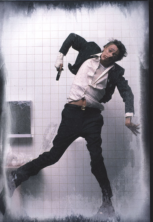
David Bowie: Lodger outtake ®1979 Brian Duffy
Brian Duffy’s still harrowing shots for Bowie’s “Lodger” were always the most harsh and extreme wrapper to sell a much less overtly threatening album. Only the disturbing “Repetition” fit the tone of the cover that closely. It probably contributed to the overall soft sales for that particular Bowie opus. If ever an album cover said “don’t touch me!”it was that one.
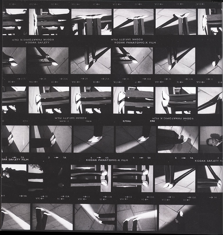
Joe Jackson: “Look Sharp” contact sheet ©1979 Brian Griffin
The book is split fairly evenly between monochrome and color photography, but the black+white here just looks more lovely. One of the best b+w photos ever was Brian Griffin’s truly iconic shoot for the Joe Jackson debut album, “Look Sharp.” Those Denson’s he’s rocking more than fit the title and seeing Griffin’s contact sheet throws his methodologies out into the open. Seeing the train of thought until the “eureka” moment he ultimately captured is one of the joys of this book.

The Tourists: “Reality Effect” outtake ©1979 Gered Mankowitz
Even some of my favorite color images, hew closely to the monochrome spectrum of tone. I loved Gered Mankowitz’s Pollock-inspired cover for the second Tourists album, “Reality Effect” since it was released in 1979. It’s fascinating to see the composition in white above with the band members before the paint began flying. According to Mankowitz, the intent was to have the musicians paint objects in the room brightly, but after a few doses of LSD, that idea went out of the window[pane] as they splattered each other instead.
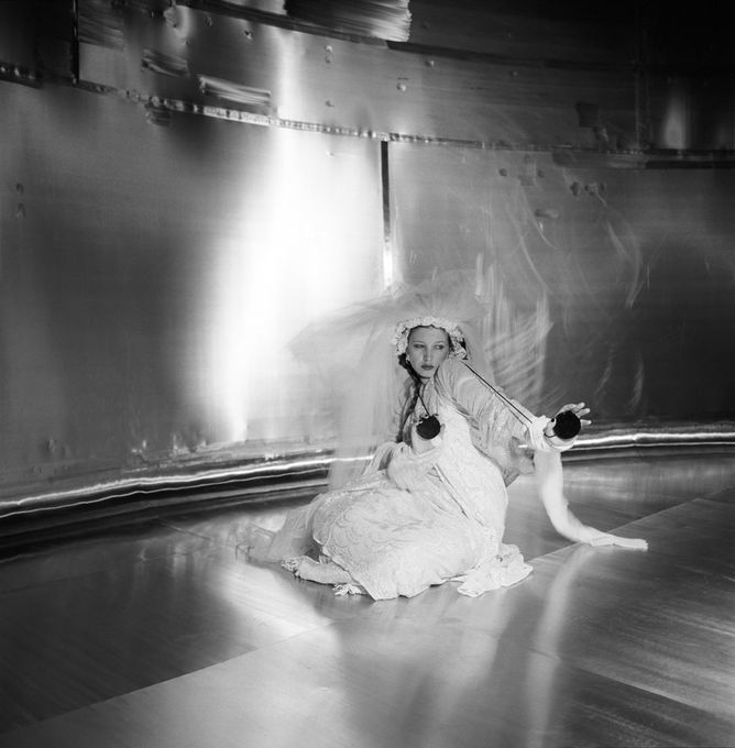
Lene Lovich: “Flex” b+w outtake ©1979 Brian Griffin
I especially loved the full coverage of Lene Lovich’s first two album covers here. Has there ever been a more photogenic woman artist? her emoting for the lens as seen here, would put her at the forefront of the modeling world, if she didn’t have so much more to offer. It was lovely seeing the black and white film shot in the stainless steel fermentation tanks of the Guinness brewery in London. I’m more familiar with the gel-toned ultimate color shot, but the black and white shots go further at capturing the metallic sheen of the setting. How I’d love to see an actual print of these shots in a museum one day.

JAPAN: “The Tin Drum” contact sheet ©1981 Fin Costello
I like seeing the grease pencil markup on the JAPAN “Tin Drum” cover. The differences were so slight between the takes that the final choice almost seemed arbitrary in that each one was equally stagey and poised. Among all of the visual paths not taken, the text here also contains essays by a few famed photographers, giving their own spin on the work. People like George DuBose, famed for his early B-52’s cover photography. His quote about Lydia Lunch vs The B-52’s was priceless. Elsewhere, Torcinovich reveals that he discovered who took the iconic photo [not credited] for Iggy Pop’s “The Idiot.” If you share my penchant for this music and the wrapper it came in, then “Outside The Lines” is a superb addition to your music design library.
– 30 –


![Chris Cross: 1952-2024 [part 2]](https://i0.wp.com/postpunkmonk.com/wp-content/uploads/2024/04/ultravox-cross.jpg?resize=200%2C200&ssl=1)


This is a great book! Contact sheets and slide pages used to be what my life was about.
In the mid 80s I persuaded my agency to try to go after Brian Griffin for US representation…it was a non-starter, he was locked up with worldwide representation. We did manage to get Mick Rock on our rolls – so all the amazing Bowie, Iggy, Debbie Harry, Syd Barrett work, including outtakes of the more famous images was just a joy to behold. We rep’d George DuBose for what seems like just a minute, as well as Gered Mankowitz, which was honestly, difficult. Bob Gruen, was a founding photographer of the agency, and we were very reverential of his body of work with John Lennon, Blondie, KISS, The Clash and Sex Pistols. On those three artists alone his career is rather stellar, but it’s his having been in the right place at the right time for both NYC Punk/New Wave and British Punk at it’s London best/worst, that was ALWAYS what I favored.
One of my photographers, who I don’t believe is included, is Kate Simon. She has an amazing body of work including Beat Poets, Reggae Superstars, Punk Rockers among her files. One of my favorite pics and contact sheets are those from the outdoor session which found it’s way on the cover of The Clash’s debut album. I have a signed copy, by Kate, of my favorite shot from the contact sheet which I cherish.
LikeLiked by 1 person
Name-dropper! :)
LikeLike
Echorich – I figured you could shed some light on this posting as it all but had your name on it. Ever have any run ins with Trevor Key? I miss his work. He’s one of the few rock photographers whose métier was not necessarily portraiture, per se.
LikeLike
I have just received this book after reading this post a while ago,it is indeed a gem of a tome.
The Lene Lovich and Nina Hagen shots are my favourites,but it’s all good.Great to hear back stories and anecdotes.
I managed to get it new for £5 online,so quite a bargain.
LikeLike
Gavin – Glad you were able to find a cheap copy. The book was quickly remaindered here, yet it is packed with goodness. I’m right there with you, particularly on the Lene Lovich material. She has the ability to rivet the camera’s attention. There is such a surplus of otherworldly poise and confidence in her. Put her in a situation with Brian Griffin and all bets are off!
LikeLike