ALBUM 6: New Gold Dream [81, 82, 83, 84] | 1982| designer: Assorted iMaGes

Virgin Records | UK | LP | V 2230

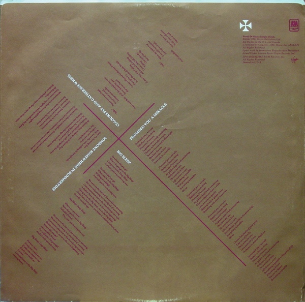
Back cover
Last post had a comment from Echorich stating that “Malcolm Garret had his finger of the pulse of the 80s.” With their next album, one might be tempted to say the same… except it more accurately reflected the 1380s! The cover of “New Gold Dream” made an incredibly bold statement at the time. Who else in their right minds would release an album that looked like it belonged in the sacred music section of the store, yet was the work of a Post-Punk band at the acme of their powers?
Designer Malcolm Garrett had tread lightly on this Pre-Reformation aesthetic with the cover of the pre-release single, “Promised You A Miracle.”

The calligraphic fonts, the handmade paper, and the cross formée were but a hop, skip and a jump from the full blown sacre coeur crucifix as found in France. The use of the metallic fifth color on the sleeve, managed to take it way over the top. I have to admit that I still don’t have the original UK pressing of this. Mainly because the US pressing went far in taking it to the extremes that paid off in spades. The US pressing was on transparent vinyl with marbleized burgundy and gold shot through the vinyl. And it was a $6.98 list price! If there were any imports in US stores, I never saw them.

The US edition trumped the original in almost every way. The labels were night and day superior, with the art department of A+M Records taking the time to build on the overall look in a dramatic way. Compare the UK labels to the US one.
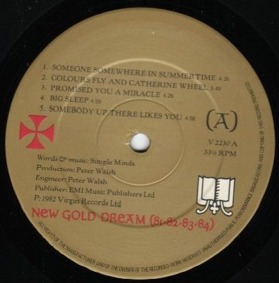
UK labels

US labels
You might think “game over,” but wait… there’s more. Now how much would you pay?
US inner sleeve
The US inner sleeve was on gold paper like the UK pressing [can’t find an image, sorry], but the US sleeve featured the lyrics in a clever layout that managed to make this album a powerful, cohesive whole that threatens to go over the top. All of this looks like so much hyperbole, but not after you’ve heard the album within that package! I’ll never forget the first time I bought this and brought it home to play. I was thunderstruck by the synergy between the music and packaging. Over the ensuing 33 years, I’m even more in awe of the music, which stands alone as an even more spectacular achievement than the admittedly fine design work.
There is a single dramatic variant of this plush, albeit Christian-oriented cover art. When Non-Alignment Pact member state Yugoslavia licensed the album, the state run Jugoton label balked at this and remixed the cover art into something a little more secular.

Jugoton Records | YUGOSLAVIA | LP | LSVIRG 11016
Next: …More covers to go [I’ll try to hurry]


![Chris Cross: 1952-2024 [part 2]](https://i0.wp.com/postpunkmonk.com/wp-content/uploads/2024/04/ultravox-cross.jpg?resize=200%2C200&ssl=1)


I think the album art for New Gold Dream fits well with the direction the music took here. Much of NGD is haunting and quite spiritual – not necessarily religious. NDG finds Simple Minds exploring the depth of music and emotions and the seriousness of the music is reflected well in Garrett’s art direction. “Synergy” is the perfect word Monk!
LikeLike
No need to hurry Mr. Monk, take your time. I’m enjoying this bonus content immensely! I remember Bob Ponder playing NGD for me at Retro Records for the first time. So much amazing music to process In 1982, but I knew immediately that this was something very special indeed.
LikeLike
Brian Ware – I’m trying to remember if NGD was the 2nd or 3rd Simple Minds record that I bought. “Sweat In Bullet” 2×7″ was definitely the first, but I think that I bought the US 12″ of “Promised You A Miracle” a few weeks before the album was released. I remember picking that one up in the record store in the Factory Outlet Mall, as I recall. What was the name of that store? Do you remember?
LikeLike
I only went to the Factory Outlet Mall once and that was in the late 80s. Could it have been Record Bar?
LikeLike
Brian Ware – Maybe. I can see the logo and it looks familiar. I thought I sent you over there earlier than that to pick up that stray US Chrysalis “Hey Little Girl” 12″ I’d seen at one point.
LikeLike
I remember picking up that record but don’t remember it being at the Factory Outlet. Could that have been one of the stores at the Florida Mall? Maybe even Camelot?
LikeLike
The lyrics on the inner sleeve were the original design made by Garret and not by A&M. However, Jim Kerr preferred not to have the lyrics printed so the UK release omitted them. Every other European release did have the same inner sleeve as printed above though.
LikeLike
Nisei – Welcome to the comments! Ah, so Garrett designed the inner sleeve, then, as part of the package? That makes sense. It looked too nice [and integrative] to have been an ambitious bit of work from the local label.
LikeLike
Thanks. Glad to have found this blog.

Yes, that’s correct.
Well, A&M did do a great job on the label for the gold/purple vinyl US release!
It looks great in contrast to the colored vinyl. However, I do think that on black vinyl it would look kinda dark and not really suit the rest of the design (I don’t know if the same label was ever used on black vinyl releases). The only thing I dislike about the UK label is that he left aligned the text which makes it off balance.
Oh by the way, only first pressings of the UK release had the gold inner sleeve. Later releases had a purple inner sleeve which can be seen here:
LikeLike
i have more than 10 different versions of this album:
US cassette
US lp black vinyl
US marbled vinyl
CAN gold vinyl
US CD
UK CD
CAN CD
EUR CD
GER CD with new gold dream extended mix
YUG lp alternate cover
EUR mini lp CD remaster
US LP 180g Abbey Road half speed remaster
UK DVD-A
UK super deluxe box edition
JAP LP with obi strip
US Bluray audio
also:
ITAL 7 inch new gold dream
https://www.discogs.com/Simple-Minds-New-Gold-Dream-81-82-83-84/release/2734077
ITAL 12 inch new gold dream
:format(jpeg):mode_rgb():quality(40)/discogs-images/R-447468-1445437844-5914.jpeg.jpg)
https://www.discogs.com/Simple-Minds-New-Gold-Dream-81-82-83-84/release/447468
guess i liked the album.
later
-1
PS: Feel free to fix the image links
LikeLike
Thanks for all the comments guys. I only just found this blog and am flattered by the posts. I’ll put a link to it on my own website.
I much prefer the golden UK label, for New Gold Dream, with the left aligned text. But then I would. ;-)
LikeLiked by 2 people
Malcolm Garrett – Welcome to the comments! Mr. Garrett, your table is waiting, sir. As we are friends with Mr. Kolnsberg, and we were both attending the Human Seventeen extravaganza that did not happen in March, I had hoped that I might be able to meet you at one point and try not to fan-gush, but alas, fate has conspired to monkey-wrench that notion. Mr. Kolnsberg had mentioned to me of your reticence towards collecting monographs of your work and I must say that this notion created a large, Assorted Images-shaped hole in my graphic design library and I would urge you to rethink this attitude. Sure, I’ve got hundreds of records with your imprint, but that’s only part of your story.
As for the flush left vs. centered conflict, I have to admit that I often side with the justified faction. Nesei in the comments has said that all other European pressings had the lyric layout on the inner sleeve as in the US edition and that you had designed it but Jim Kerr was reluctant to have the lyric printed on the UK copy. Was that the case? The layout was too well considered to have been the work of the US designn staff, so I’m not surprised to hear that you had also designed it.
Given that the album was widely available in America, I don’t think I ever found a copy of the UK LP to buy in my wanderings. There are numerous core collection UK pressings of favorite albums that still need to be in my Record Cell one day, and it’s one of my failings that with at least 6 pressings of “New Gold Dream [81, 82, 83, 84]” that a UK 1st pressing LP still evades my grasp.
LikeLike
I used to joke with a fellow designer who was from Seattle that centred type was, as he phrased it, ‘the English disease’. I have to say that I am primarily a ‘modernist’ when it comes to typography so tend towards sans-serif and range left. Simple Minds during this period were an exception and a modern/medieval look prevailed. I couldn’t resist the challenge of fitting a range left format into the circle of the label. Centering the type felt too easy to me.
As regards the inner sleeve, I’ve forgotten the actual detail, but yes that was my design. I’m not sure if it was Jim that vetoed it in the UK, but it certainly sounds correct. He was always hesitant about divorcing the words from the music, as is quite obvious to me given the way the words flow in audio space.
By the way, ‘Sons and Fascination’ featured as one of nine Malcolm Garrett sleeve designs spanning 40 years that were posted in a two day ‘takeover’ of the Michael Clark Company Instagram @michaelclarkco. Check it out and the notes that accompany each sleeve.
There are more notes for each at the complementary posts my own two IG accounts @beingmalcolmgarett and @collectingmalcolmgarrett. Maybe some of your readers will enjoy the posts too. And there’s a link to a Spotify playlist ‘coming : being : going’ of tracks from all nine records, and downloadable pdf notes for each, on my website malcolmgarrett.com
Oh and I’ve added a link to this Blog. ;-)
LikeLiked by 1 person
Haha, nice to hear your reasoning behind the alignment of the text. I don’t know but when I have to put text inside a circle I always feel it’s a clash of shapes when I use flush left, flush right or justified. It just doesn’t feel right to me.
Jim’s reasoning was indeed that he didn’t want the lyrics to be separated from the music. He didn’t want people to read them without listening to the songs because they were never intended to be just written words. He would often change lyrics when a song progressed because it better suited the flow of the song.
LikeLike
Malcolm Garrett – So you were vying for the deliberate paradox of creating a medieval/modernist vibe with “New Gold Dream [81, 82, 83, 84]” then? I did a similar juxtaposition with the PPM logo, which used ultramodern Futura Medium in multicolor as well as radical leading that I would have gotten horsewhipped for in design school but when you’re as old as me, breaking such rules is just fine. But since I am also touching on the medieval at PPM, I centered the text. It didn’t work as strongly when I first set it flush left.
I will say that on the black vinyl UK LP the original label worked to an advantage. Centered text would not have been consistent with the Simple Minds visual identity that was well established from the point of “Real To Real Cacophony” and its attendant singles onward. The NGD cover art utilizes the tension from the text, which is all flush left, and the crucifix, which ties the band name and title together to achieve balance. But given the lush overkill of the US colored vinyl, I think what A+M designed for the LP label played well against the very different looking LP.


Had they simply used the UK label art it would not have worked as well.
Clearly, a redesign of some sort was needed. A recolor of the original design would have worked, but no one asked us.
Back then, Kerr was working a much more abstract lyrical action that relied on juxtaposition with the dynamic music to bypass the left brain hemisphere and work on creating an abstract gestalt, so maybe he was correct in dropping the lyric sheet, Though their most abstract album, “Empires + Dance” had one, but with the dissonant caveat of having the “R” and “N” reversed in the brutalist Gill Sans Regular lyrical copy, set even more strongly in all caps!
I must say that “Sons + Fascination” is for me the quintessential Simple Minds cover. The cover art from that campaign was probably my first exposure to Bauhaus design principles that I would be taught beginning the next year. Well, I had seen the “Different Kind Of Tension” sleeve in 1980 as I.R.S. Records had actually serviced the radio station I worked at in my high school with promos but I never had any Buzzcocks records personally [one of my many failings…]. So I fully understand the import of the Michael Clark Company selecting that album, which was to layout what Mr. Clark is to dance. I remember encountering him first in Scritti Politti’s “Wood Beez [Pray Like Aretha Franklin]” video. Alas, I do not have an Instagram account to read any of these posts. I normally eschew social media and give FB, Twitter, and Instagram a pass on that account. I will dive into the bucket for those PDF notes on your website, though! And many thanks for the link from your home page! I will reciprocate since you are one of my favorite designers.
LikeLike
It’s funny I have little to no technical design knowledge, but as soon as I saw the Sons sleeve I fell in love with it, as I had with the previous singles from the album. Same goes for Tension.
LikeLike
Oh I forgot something:

The European release had a glossy cover (UK had a matte finishing) and although the gold printing looked way better than on the UK release (such a shame none of the CD releases were ever printed with a gold spot colour, not even the Deluxe Box Set), it had this green flare in the marbled background. Do you have any idea where that might come from? We were still pre-digital back then and I’ve always wondered if someone has done that intentionally or if it was a by-product of reproducing films to make printing plates.
I’m not sure if this’ll work but here’s a link to a picture of the European release:
LikeLike
Nisei – The vagaries of color repro are legion, but the US LP I have certainly did not show that shift in hue. The US copy has a satin finish [not quite gloss] and the gold was printed as a 5th metallic color. It sure looks overprinted on the cross and marbling. Too bad there was not an embossed foil stamp version of this amazing album! That on an otherwise matte cover would be a knockout. Have you seen the Scritti Politti “Cupid + Psyche” limited edition foil stamped, embossed LP? It’s quite luxe, and from the pen of Keith Breeden who spun off his firm DKB following his time in Assorted Images! I just looked and far more countries had that edition than I suspected at the time.
LikeLike
Mr. Monk,
For a very entertaining and informative interview with Mr. Garrett, although it concentrates on Duran Duran, Simple MInds is mentioned.
https://louderthanwar.com/interview-malcolm-garrett-speaks-about-his-ground-breaking-artwork-for-duran-duran/
Feel free to move the comment as applicable.
later
-1
LikeLiked by 1 person
Pingback: Forty Years Ago Today, Simple Minds Changed Everything with “New Gold Dream [81,82,83,84]” | Post-Punk Monk